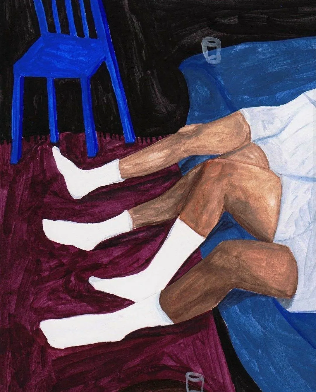
Design is not decoration: Lella and Massimo Vignelli at Triennale Milano
Studio Mut’s Thomas Kronbichler on curating the Vignelli retrospective at Triennale Milano — the freedom of not being a devotee, the “madness” phase, and why blank pages beat mood boards
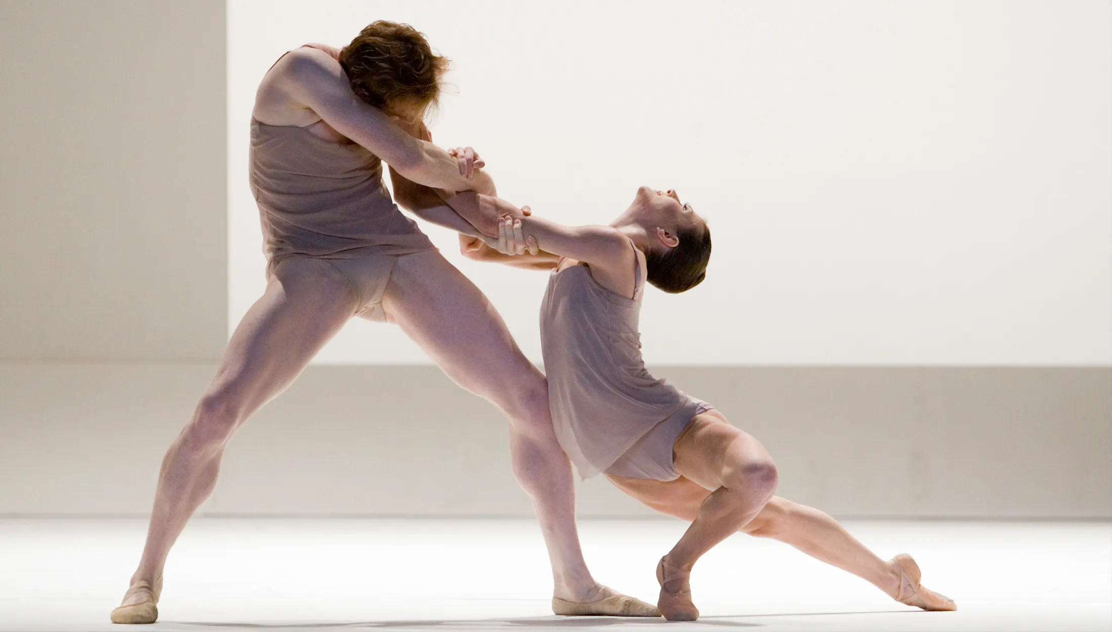
Lella and Massimo Vignelli. A Language of Clarity, a retrospective dedicated to Lella and Massimo Vignelli’s life and work, opens to the public from March 25 to September 6, at Triennale Milano. Thomas Kronbichler reflects on the exhibition, which he curated with his Studio Mut partner Martin Kerschbaumer, in collaboration with Triennale director Marco Sammicheli and Francesca Picchi.
Thomas Kronbichler: People follow the work of the Vignellis almost religiously. We don’t approach it that way. We respect and admire their work, but not in a dogmatic sense. That gives us freedom. If you’re doing an exhibition about the Vignellis, the safest path would be to show the greatest hits. We decided against that.
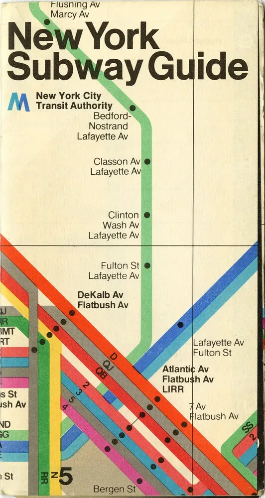
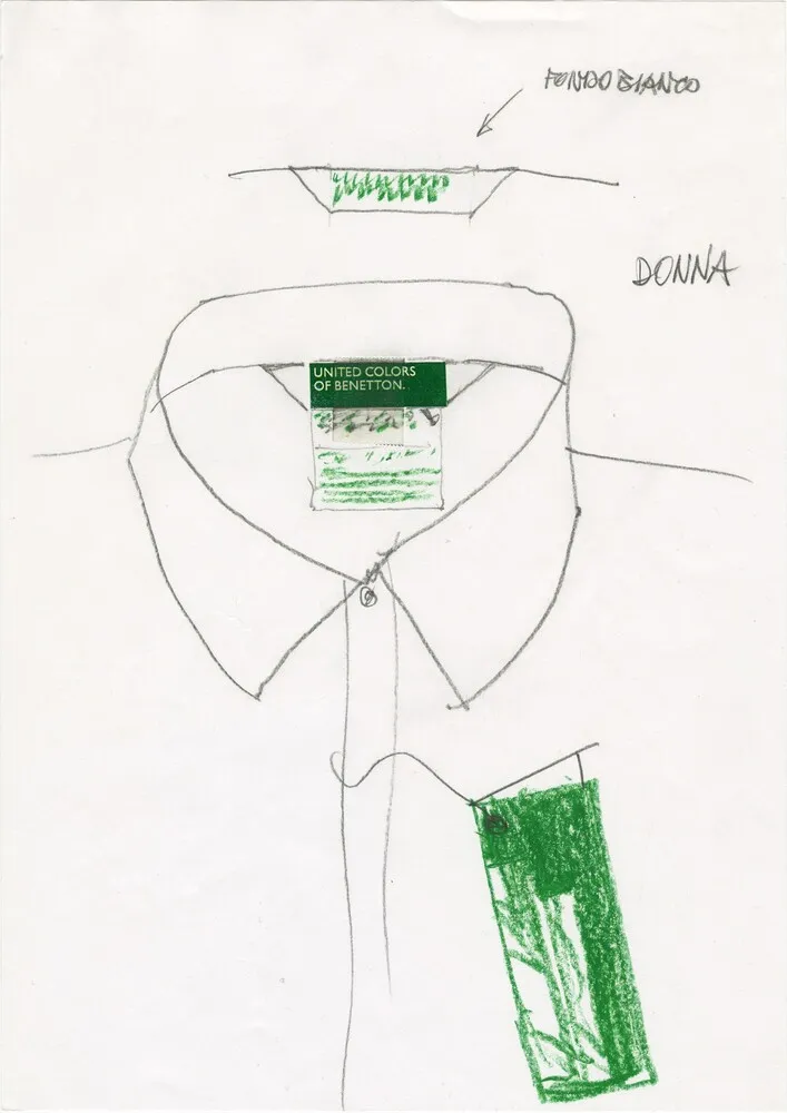
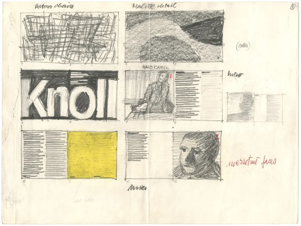
The most known works are included: the New York subway map, United Colors of Benetton, Ducati, and many others. We also show sketches, experiments, development processes. It opens the work up and makes it more accessible, especially for younger audiences.
We wanted to show that Lella and Massimo Vignelli had passion, openness, and fire for creativity — for the process, for graphic design, for product design. They had this idea that all design is, in a way, the same. Massimo Vignelli always said, If you can design one thing, you can design everything. They were masters of this. They would design the corporate identity for a hotel, then all the dinnerware on the tables, then everything else — from identity to print to product, to the entire environment. The Vignellis are often seen as modernist figures — systematic and rigid. Their design can feel precise, almost technical. What we actually wanted to show in this exhibition is another side of them — the passion and character in their work.
Who were the Vignellis: design, rigor, and a visual language that reshaped the twentieth century
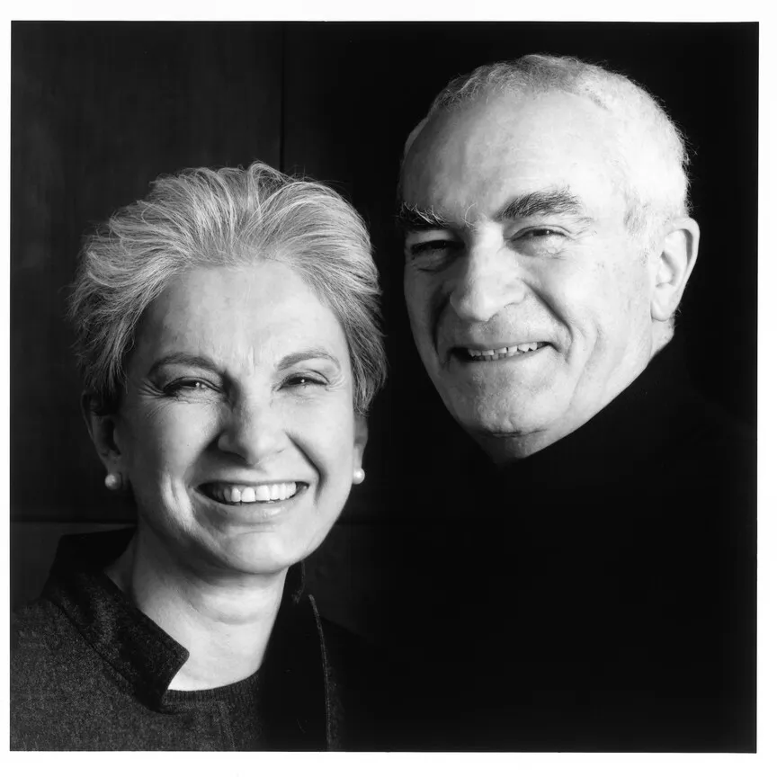
The Vignellis are, in many ways, a design mythology. Massimo, born in Milan in 1931, and Lella, born in Udine three years later, built their careers across two continents — trained in Italy, formed by the rigor of mid-century European modernism, then transplanted to New York in the mid-1960s, where they would spend the rest of their lives reshaping the visual landscape of American public life. What they left behind: the conviction that design, at its best, is a discipline of reduction — that clarity is not an aesthetic preference but an ethical position.
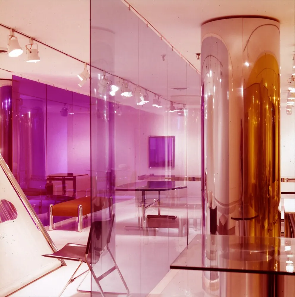
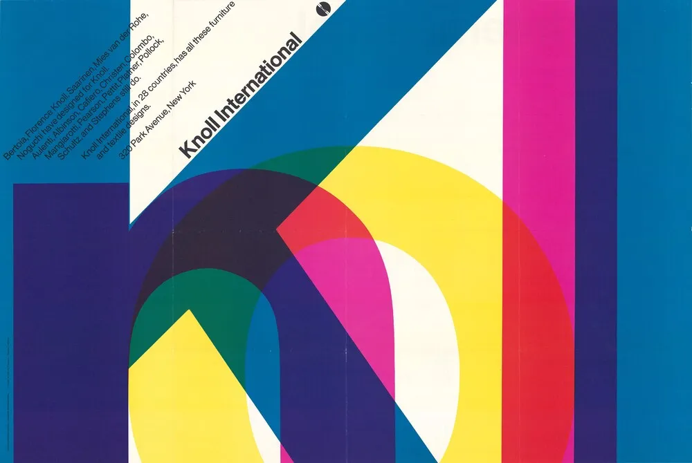
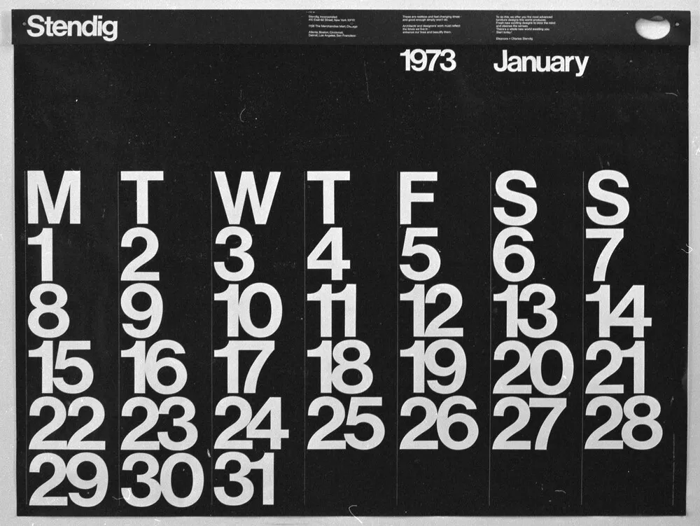
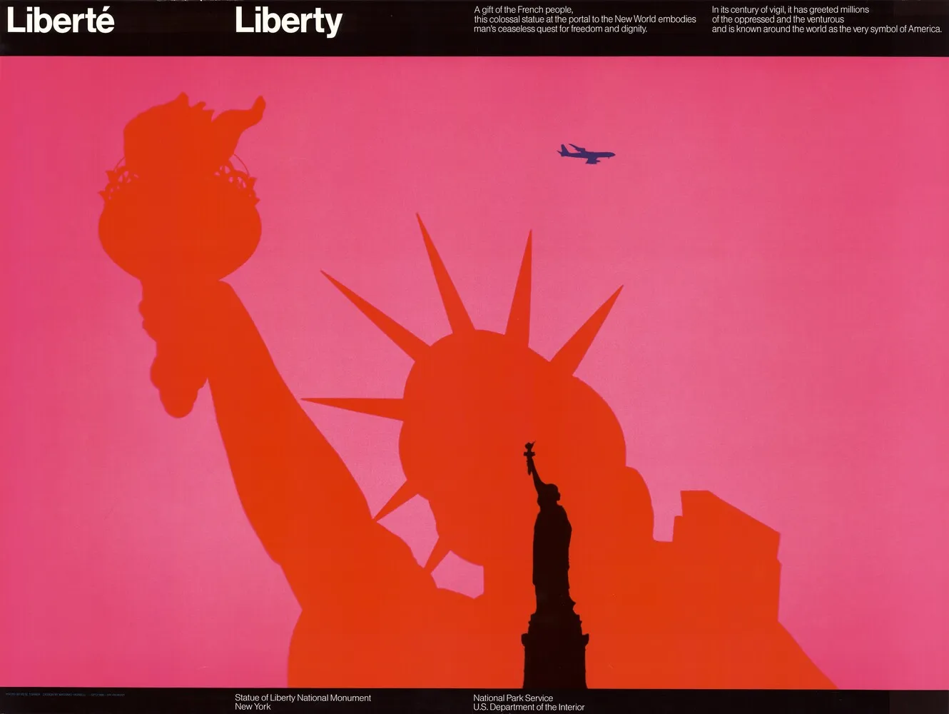
Their range was unusually wide. The 1972 New York City subway map — perhaps their most debated piece — rewired the way millions of people navigated a city, replacing geographic accuracy with diagrammatic logic. The American Airlines identity, the Knoll graphics program, the Heller tableware, the Bloomingdale’s shopping bag: these are objects that moved between the gallery wall and everyday life with equal ease, refusing the distinction. Lella’s architectural sensibility shaped the spatial and product dimensions of their practice — furniture, interiors, exhibition design — while Massimo’s graphic work gave form to institutions, corporations, and cultural organizations on both sides of the Atlantic. Together, they operated as a single design mind housed in two people.
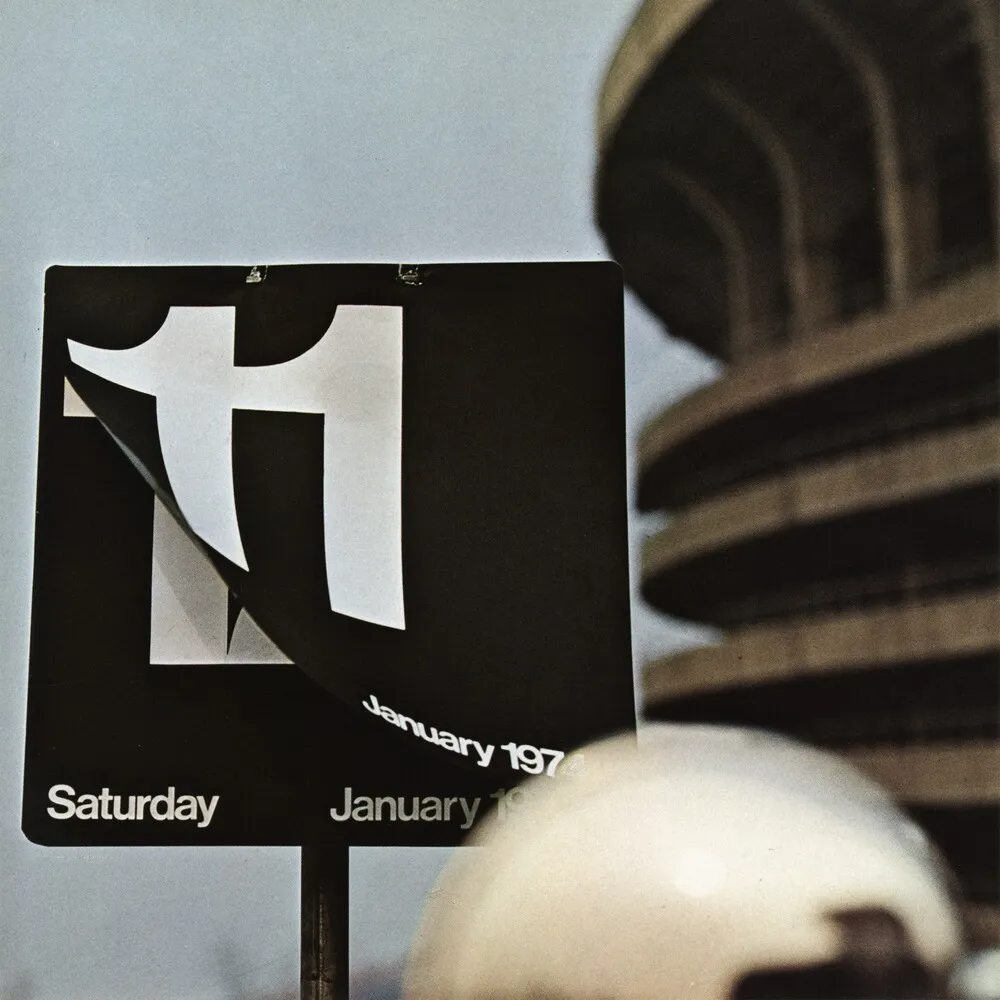
What made their approach radical — and what still generates friction — was its almost philosophical refusal of ornament. Massimo was categorical: a vocabulary of six typefaces, a systematic use of white space, a distrust of decoration that some read as austerity and others as arrogance. The work polarized. The subway map was eventually replaced, in 1979, because the public found it too abstract — too designed, in a sense. Yet it was rehabilitated decades later, reissued as a collectible, taught in schools, cited as a landmark of information design. This oscillation between rejection and canonization is itself revealing: the Vignellis consistently produced work that forced a confrontation with what design is actually for.
Thomas Kronbichler on the design process of Studio Mut and where it begins
Thomas Kronbichler: We’re graphic designers. Our work usually sits on the other side of an exhibition — catalogues, graphics, the visual systems that frame it. The curatorial side of it puts us in a different position. We were invited to take on the curation by Marco Sammicheli more than a year ago. The work took us across different locations. We traveled to the United States, spent time in Milan, worked closely with the team throughout the process.
We don’t use mood boards. We don’t do competitor research. A blank page — this is the starting point for every project. Then, discussion. A white canvas and a conversation go a long way; it’s where most of our ideas are born. Being in the studio, you don’t need to schedule meetings and brainstorm. It all comes naturally in that environment. Starting a design project from nothing can feel uneasy at first. During the first two weeks, everything feels off, nothing seems to click. We’re already familiar with this phase. It never gets easy, but with time, we’ve learned to manage this faster. The best inspiration comes from places that have nothing to do with design. Most of what I find interesting comes from art, architecture, movies, and music, particularly.
There’s always music playing in the studio. No headphones. It should be loud enough for everyone to listen to. Each person plays their music for the rest. It’s a shared experience of showing what you love and learning what others like. Music lovers and other designers often join us too. You understand each other on a new level. The idea is that fresh music sparks new input. It opens up feelings and perspectives that feed directly into the creative process.
From research to design: The phase during which Studio Mut doesn’t ask for permission
Thomas Kronbichler: At university, you learn to do research first, then experimentation, only then do you build something. Our process doesn’t look like this. An initial conversation first, then we get in a small group of two to three people and enter a phase we call “madness,” which is quite self-explanatory. It’s a phase of trying out everything that comes to mind. All ideas, inspirations, thoughts go into a folder named “madness” — we have this for every single project. For a design like a logo or identity, there might be twenty different experiments. Sometimes, one or two of them turn out to be interesting. There is no judgment in this phase — only a continuous process of testing and exploration.
At the core of this process lies a key principle: we never talk about ideas or concepts, only what’s visible, what is already there. We’ve learned that design is about the work, not the thinking. Practice comes before theory — it’s through doing that the work reveals itself. It’s similar to composing music: you play the first chord, the next one becomes inevitable. Third, you have music. This is what happens in the “madness” phase. We try everything until two or three directions prove themselves worth developing. From there, we go deeper.
For an identity project, for example, we develop those ideas extensively. We design stationery, posters, small objects, maybe even animations. We push it very far before the client sees anything. We don’t involve the client at that stage. We don’t ask for permission during this process. We decide what works, then present one direction, fully developed and clearly defined. In about 90% of cases, the client approves.
Between typefaces and meaning: How form takes shape in Studio Mut’s designs
Thomas Kronbichler: Typefaces are the flavor you add to the text. Content is always the backbone. Words are the key part of the design, but typefaces shape how words are perceived. Think of it like a meal: the content is the main ingredient; the typeface is what enhances it. Sometimes the effect is subtle, sometimes it’s more pronounced — each choice shifts the overall tone.
Choosing a typeface is a conscious process. We may go through several before finding the right one — changing, adjusting, refining. In the end, the ones that stand the test of time tend to work best. Many fonts may look good now but feel outdated within a few years; only a few truly endure. The Vignellis had a list of six typefaces that they used for almost all their projects — a bit extreme but grounded in a clear logic. You can do a lot with just a few well-designed typefaces.
We have a few typefaces we return to often. Akzidenz-Grotesk is one of them — the precursor to Helvetica. It’s rougher, with more character. It doesn’t try to be special, yet it is. A strong, reliable typeface. We also like Times New Roman. Often underestimated, but very good. The same goes for Arial. There’s nothing wrong with it — it’s a safe, timeless choice. I’ve used Arial for entire corporate identities, even for album covers. It works.
At the same time, we work with custom typefaces. We have friends who design fonts, and for certain projects, especially for institutions like museums, it’s interesting to create something specifically for that context. A typeface inspired by the architecture, the collection, the history of the place. So we can move in two directions: typefaces with almost no flavor, or typefaces that are highly specific.
Thomas Kronbichler on how misusing tools can expand outcomes in graphic design
Thomas Kronbichler: We’ve been using Figma to design posters. It’s a tool meant for websites and apps, but we push it elsewhere. Misusing tools is part of the process. Adobe Suite is always a standard choice. We’ve been working with Affinity as well. Cavalry works best for animation. Even Keynote is something I go for, though not for its intended purpose. It’s all about pushing software beyond its default logic — using it in ways it wasn’t meant for and seeing what happens.
I’m currently teaching a course on tools at university. Each student works with a different one, deliberately. The point is simple: tools shape the way you think. A thin pencil produces a different gesture than Photoshop. Photoshop produces different results than Affinity. A phone camera behaves differently from a Hasselblad. You have to be aware of that. You have to push yourself to move across tools, to keep the work open.
Tools can push the work in unexpected directions too. Sometimes we start in InDesign, then move to Illustrator, simply because the way of working changes. Then we might switch to Cavalry, go back to Affinity, return to InDesign. The shift itself becomes part of the process. It’s about breaking our own habits. It’s similar to a musician picking up a different instrument. A guitar player moves to bass — fewer strings, a different structure, a different way of thinking. The outcome changes, and that’s the point: when the tool changes, the work changes with it.
Studio Mut’s visual language: Clarity, consistency, presence
Thomas Kronbichler: Looking at our work, there is often one clear idea at the center. It’s something we identify early on, then we commit to it. We build everything around that idea and let it carry through the entire project, without losing focus or introducing elements that would weaken it.
There’s also something consistent in the way our work appears — that’s what we’ve been told. It tends to be bold. It’s not loud but present, something that holds its own space. We work with minimal elements, but we don’t aim for quietness. There is a certain energy we like to keep in the work, something that feels alive rather than restrained. We’re not drawn to things that fade into the background or become too neutral. We prefer when the work has a clear voice, when it stands out and communicates directly. That feeling of clarity and presence is something that runs through most of what we design. We try to bring that feeling into every project we do, whether it’s a project for Louis Vuitton or Armani, a curatorial work for Triennale Milano, or yet another cookbook we design. The context may change, but the intention stays the same.
Through our talks across Europe, working with students and younger designers, we try to share that same approach. Passing on a way of thinking about graphic design, about clarity, focus, and committing to an idea, is an important part of what we do. It’s also what we wanted to bring into the exhibition — to open up the Lella and Massimo Vignelli’s work and make it resonate with a younger audience.
As first-time curators, Thomas Kronbichler and Martin Kerschbaumer stepped outside of Studio Mut — the space where most of their work takes form
Thomas Kronbichler: Martin and I met at university in Italy. We studied product and communication design. After college, we did our solo travels around the world. At this time, we had small projects we did for our friends and smaller galleries. Working in a design studio in Berlin was what unlocked our passion for graphic design. We started designing posters for clients. We worked on projects for Amnesty International and the State Opera of Berlin through the studio Fons Hickmann m23, Berlin.
We founded Studio Mut twelve years ago, rather out of necessity, to better manage logistics and organize our work. Our paths crossed again in Bolzano, where both of us come from. It happened almost spontaneously, with no business plan or strategy. The creation of Studio Mut, which means a studio of courage in German, turned out to be the right step in our path.
After the pandemic, the concept of shared spaces shifted. Working together is now more deliberate. The way people gather and collaborate is no longer prioritized as it used to be. In our case, the studio became an important actor, almost a member of the team. Sometimes it demands certain things out of our creativity and projects. Being a studio, rather than an agency or a remote structure, has been pivotal for us. We started in a team of two; the studio has six designers now. We all work together at the studio. Our creative visions take form in that space. Our process lives there.
Susanna Galstyan
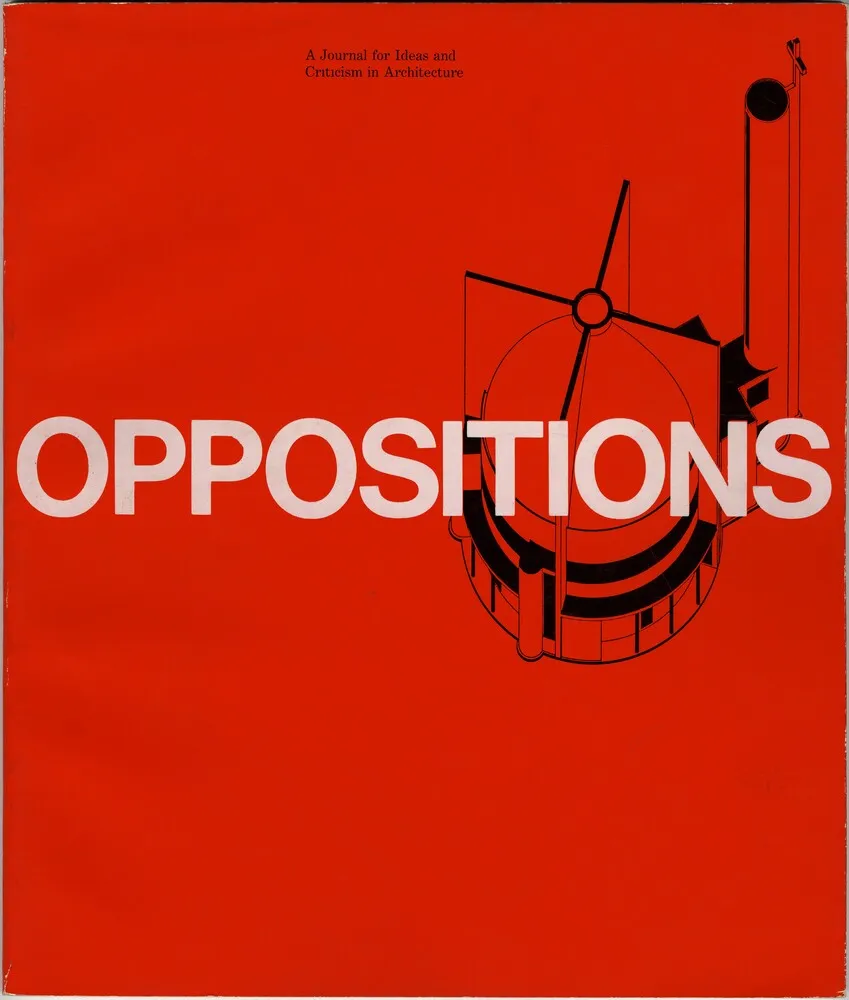
IAUS – Institute for Architecture and Urban Studies. Courtesy Vignelli Center for Design Studies