That modernist building challenged the Renaissance skyline
A rationalist landmark near the Duomo and Santa Maria Novella becomes W Florence, a LEED Gold-certified hotel where Medici iconography meets mid-century design
How a 1968 modernist building became W Florence
Florence has always been fiercely protective of its Renaissance skyline. When architect Lando Bartoli unveiled his design for the Grand Hotel Majestic in 1968, the city reacted as if someone had taken a spray can to the Duomo. His rationalist-modernist structure — six stories of sharp geometry, vertical steel mouldings, and expansive glass panels — rose at the edge of Piazza dell’Unità Italiana like an uninvited guest who refused to leave.
The building opened in 1973. By 2016, a group of artists had illegally climbed onto its roof, dismantled the hotel sign, and rearranged the letters to read ‘SEI TRE NOVE.’ It felt less like vandalism and more like the city’s reluctant admission that the building had earned its place in the conversation.
In 2025, after a full renovation by GLA and AvroKO, the structure reopened as W Florence — 119 rooms, 17 suites, LEED Gold and WELL Silver certifications, and an illuminated W logo where the old sign once stood. Florence’s first luxury lifestyle hotel has finally settled into the building the city spent decades trying to ignore.
Sharp angles, no apologies: Bartoli’s vision for a modern Florence
Bartoli’s design was commissioned by Banca Popolare di Novara, built on the footprint of a 1920s hotel. What emerged was a structure that rejected ornament entirely. No arches, no frescoes, no nods to Brunelleschi — just fluted steel mouldings climbing the façade, two-tone finishes that played with light and shadow, and ground-floor glazing that made the whole thing feel more transparent than solid.
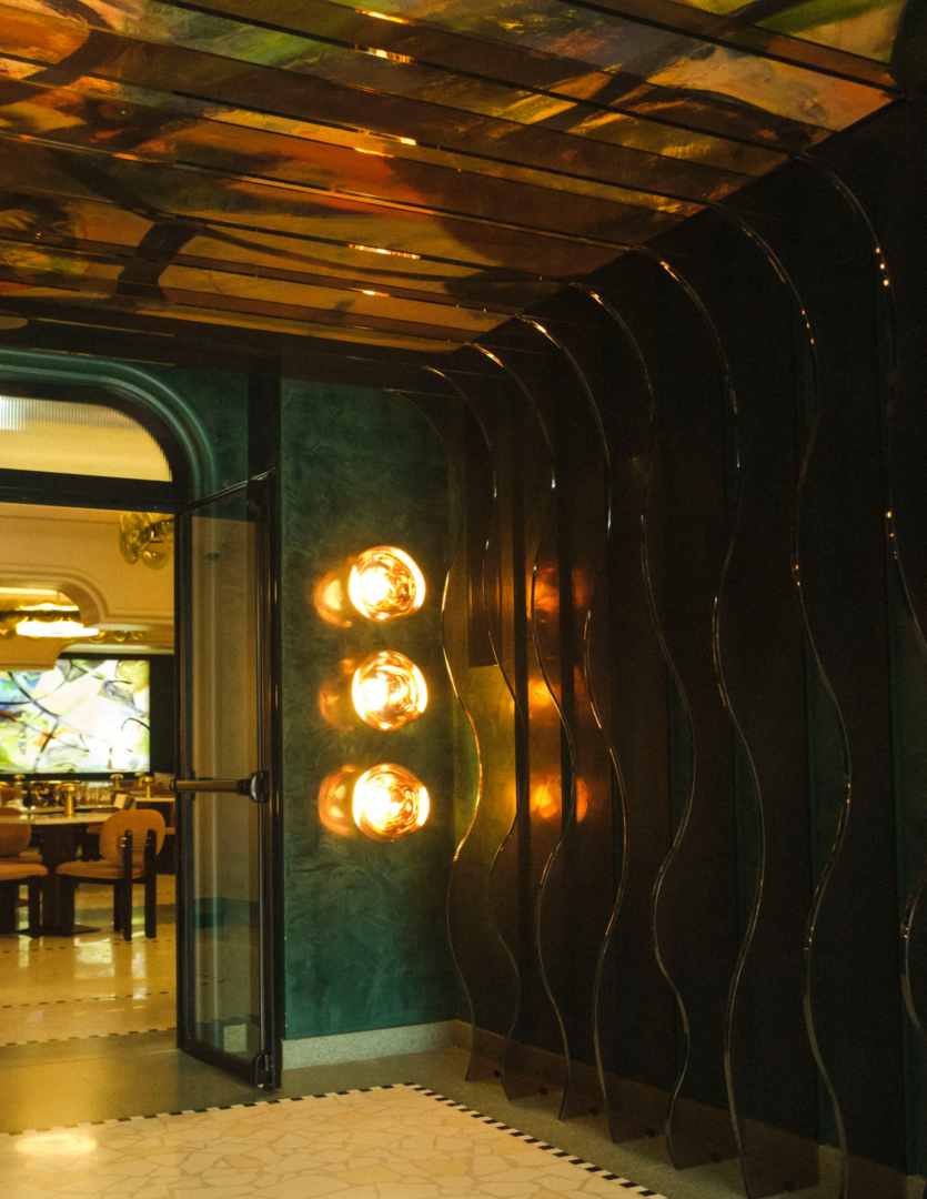
The renovation kept the bones while upgrading the skin: steel gave way to bronze, both glossy and matte, creating what GLA describes as a dynamic interplay of surfaces. The exterior now reads almost like sculpture. The slit windows remain. The transparency at street level remains. What has changed is the city’s relationship to it — even if Florence would never quite admit it.
The hotel sits steps from both the Duomo and Santa Maria Novella, and just across from Giovanni Michelucci’s rationalist train station of 1935. Together, they form a quietly defiant cluster of 20th-century interventions in a city that usually treats modernity with polite suspicion.
Medici lions, Colombo chairs, and a very deliberate kind of glamour
The reception sets the tone immediately. A wall-sized mural by Adam Ellis Studio depicts what the hotel calls a ‘Florentine Babylon Garden’ — a menagerie of exotic animals once kept by the Medici, including Hanno, the elephant gifted to Pope Leo X by the Sultan of the Ottoman Empire in 1514. Peacocks, snakes, and dense botanicals fill the rest. It’s the kind of image that rewards a second look, blending historical detail with contemporary design in a way that never tips into pastiche.
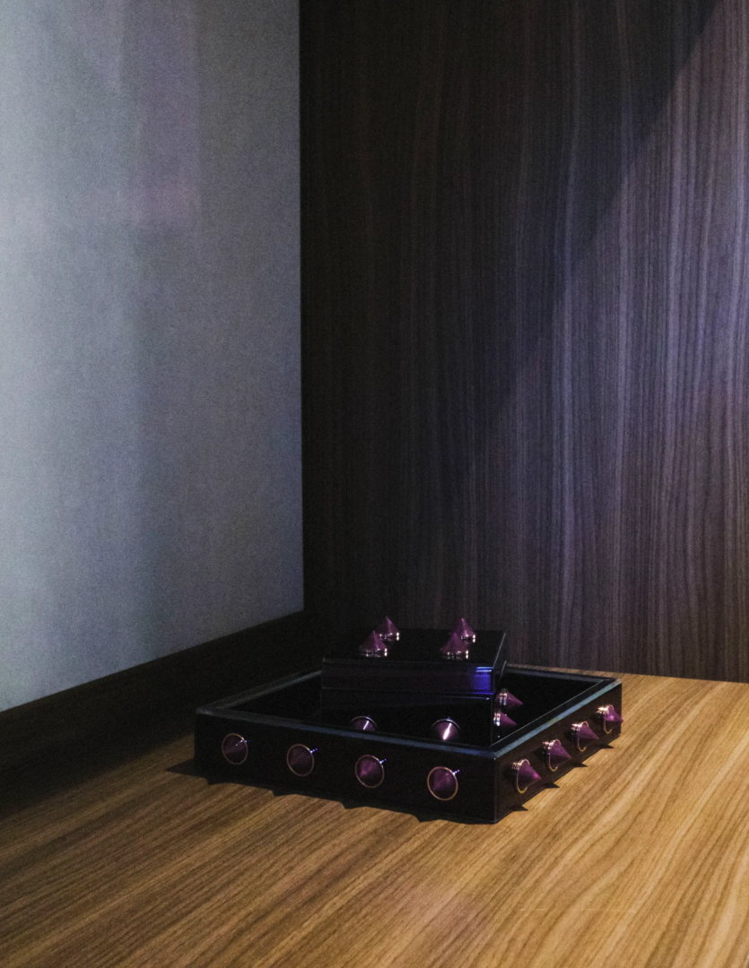
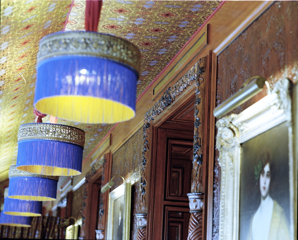
Lift lobbies on each floor feature bronze Medici lion busts on burnished metallic bases. The lions recur throughout the hotel — in artworks, in the mandalas that pattern the standard rooms, in a broader narrative that presents the Medici not as Renaissance museum pieces but as collectors, power brokers, and tastemakers whose obsessions still shape the city.
Tratto, the all-day dining space, draws on Italian industrial design — Joe Colombo’s furniture from the 1960s and 70s, specifically. Curved forms, tactile materials, artworks that celebrate Florentine gelato (a tradition stretching back, the hotel notes, over 12,000 years). The room moves easily from morning coffee to evening aperitivo without ever feeling like it’s trying too hard.
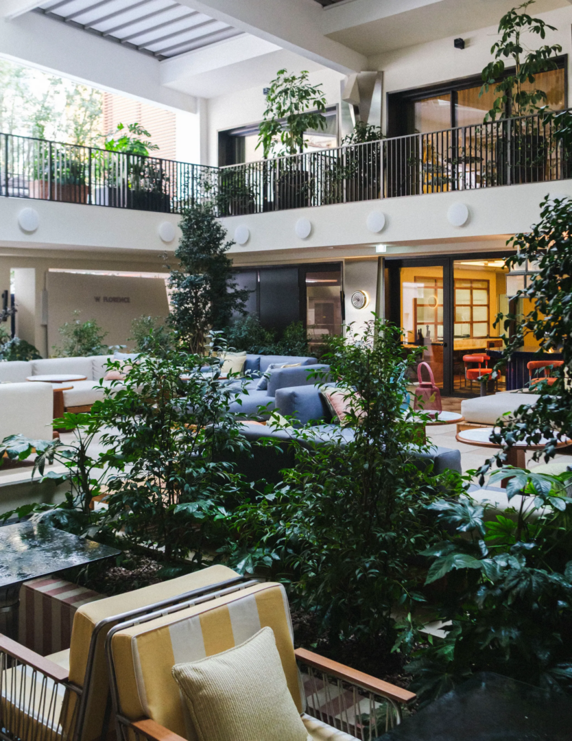
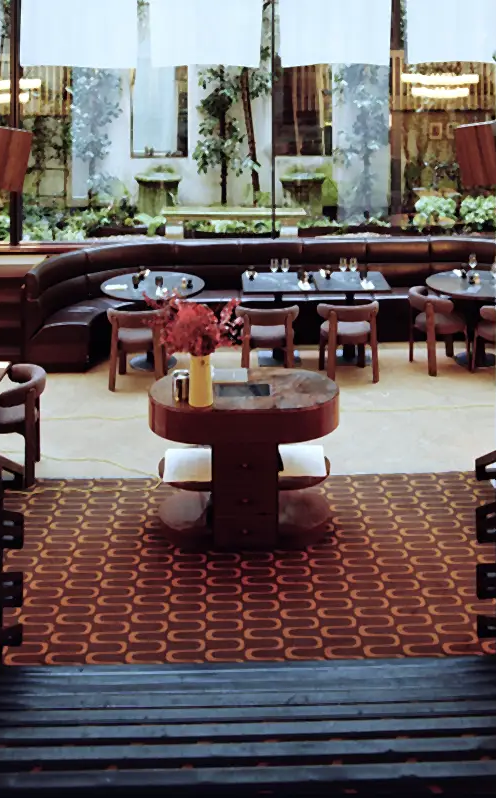
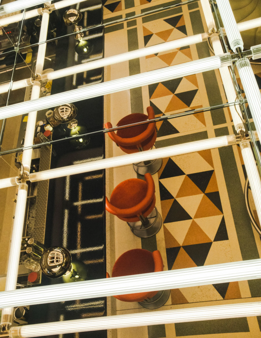
From bank vault to aperitivo: the best courtyard you didn’t know existed
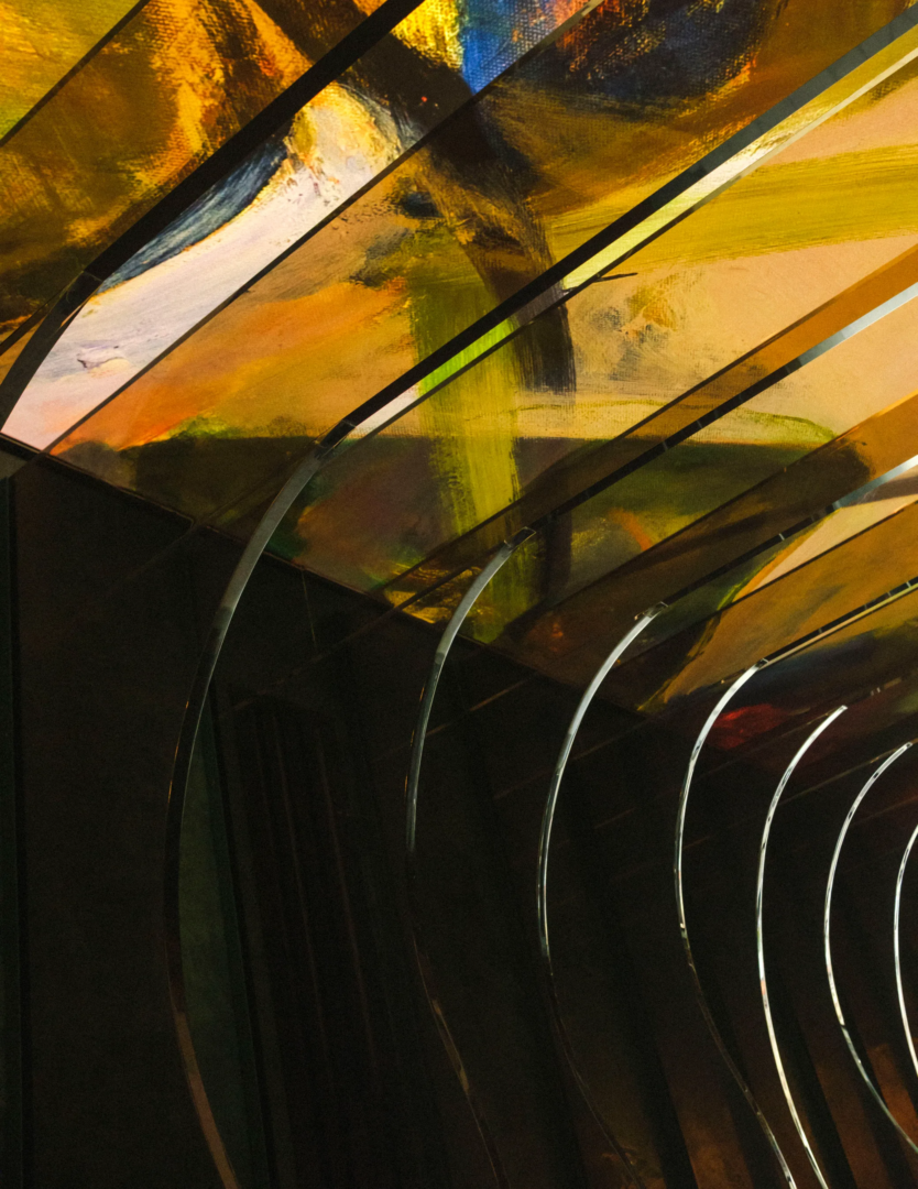
What is now the Courtyard was once a closed, heated mezzanine inside the Banca Popolare di Novara. The renovation stripped it back — raw concrete and glass, geometric floor patterns, lighting arranged to echo the linear modernist fixtures that once lit the old banking hall — and opened it up entirely, creating an internal piazza that spills out onto the street.
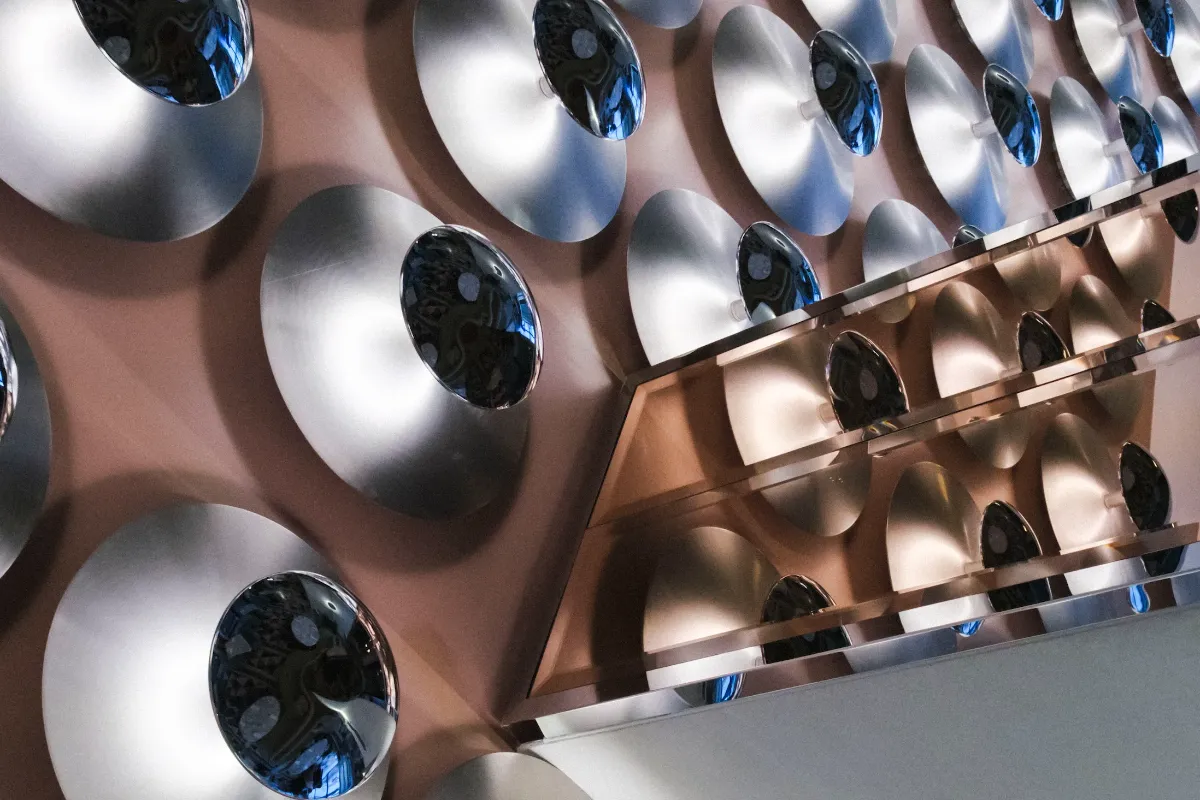
The seating references Italian design of the 1960s and 70s, upholstered in fabrics from Italian brands. The W Lounge connects directly to this space, anchored by a 360-degree bar in blue lava stone. The mirrored ceiling reflects the terrazzo floor. The back bar is stocked with Italian liquors. The whole space feels designed to be lingered in, and looked at.
Florence from above, without the queue
The rooftop offers something Florence is surprisingly stingy with: a clear, unobstructed view of the city without a two-hour queue. From up here you can see the Medici Chapels, the façade of San Lorenzo — Brunelleschi’s design, later touched by Michelangelo — and the terracotta roofscape stretching toward the hills.
The design nods to 1960s Italy: lush greenery inspired by the Boboli Gardens, custom furnishings, a canopy of lights. There’s a main area and a VIP section. At sunset, it fills with people doing exactly what you’d expect them to do. The bar serves cocktails. The view does the rest.
Two restaurants, one city: how Akira Back and Tratto reimagine Florentine dining
At ground level, facing Piazza dell’Unità Italiana, the restaurant by Akira Back is the hotel’s main evening destination. Back — whose restaurants have earned Michelin stars across four continents — brings Japanese technique and controlled precision into dialogue with Tuscan ingredients. This isn’t fusion for effect. It’s more like careful calibration: raw fish handled with restraint, rice treated as structure, local produce integrated without theatrical contrast.
The dining room reinforces the approach. Arches divide the space into distinct zones, creating a sense of progression. Palladiana terrazzo floors root the room in Italian material culture. Velvet banquettes add weight and texture. Artworks by the chef’s mother introduce an unexpected personal note in an otherwise highly designed setting. The lighting is deliberately low. Curtains can be drawn across the piazza-facing windows, shifting the room from open and visible to intimate and enclosed. It’s formal without being stiff, and conceived as a destination in its own right — not just a hotel restaurant.
Tratto runs a different rhythm entirely. Where Akira Back is calibrated and evening-oriented, Tratto is fluid and unhurried. It moves from breakfast through lunch, from coffee service to aperitivo, without changing its structure or its mood. The design references the same Italian industrial and furniture culture — Colombo’s curved forms again, modular compositions, surfaces you want to touch. The geometry is softer, the circulation more relaxed.
The food stays anchored in Italian cuisine. Seasonal ingredients, regional references, familiar formats. Nothing here is trying to surprise you. It absorbs the daily rhythm of the hotel — early arrivals, in
Sleep under a neon arch, wake up to a Negroni station
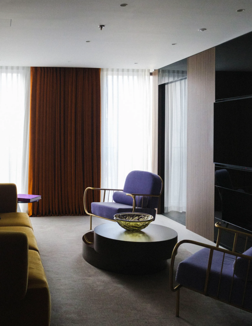
The 119 rooms and 17 suites share a consistent palette drawn from the city itself. Greens reference the Boboli and Iris Gardens. Medici red runs through textiles and furnishings. The blue echoes Renaissance skies and the colours of Florentine nobility. Wood panelling, curved travertine bathrooms, and velvet furnishings define the interiors. Above each bed, a light installation inspired by Florence’s arches — from the Palazzo Pitti to the Vasari Corridor — merges neon art with references to Brunelleschi and Leonardo. It sits somewhere between sculpture and ambient lighting.
Standard rooms feature mandalas drawn from the marbled floor of the Cappella dei Principi, incorporating Florentine symbols: sculptures, grapes, wine, the Medici lion. In select rooms, additional works by Adam Ellis Studio layer in more visual reference.
The minibar is gone. In its place: a cocktail station stocked with premium spirits. You can mix your own Negroni while looking out over the city. It’s a small gesture, but it feels considered — an acknowledgment of how people actually want to spend time in hotel rooms.
Views vary by room. Some look out over rooftops. Some frame the Medici Chapels or the cloisters of Santa Maria Novella. They’re not all panoramic, but they’re specific. They give you a piece of Florence rather than the whole postcard.
The penthouse: a private apartment above the city
The penthouse takes the top floor and the full 360-degree view that comes with it. Inside: Carrara marble, travertine, rich wood, optical-inspired textiles. A landscaped terrace wraps around the suite. The bar is fully stocked. A 3D illuminated arch references Florence’s architectural history while functioning as the room’s centrepiece.
It’s designed less like a hotel suite and more like a private apartment — somewhere for guests who want the services without the shared spaces, who prefer to experience the city from a distance they control.
Sauna, steam, and no wellness manifesto in sight
FIT, the fitness and wellness area on the lower level, does what it says: cardio equipment, weights, Pilates, yoga. Soft green tones, shock-absorbent flooring, mirror installations on the ceiling that make the space feel larger and stranger than it is.
Next door, the wellness area keeps things simple: green-tiled walls, a relax lounge, steam room, sauna. No wellness philosophy is being sold here. No particular journey is being promised. Just the infrastructure to feel better than when you arrived.