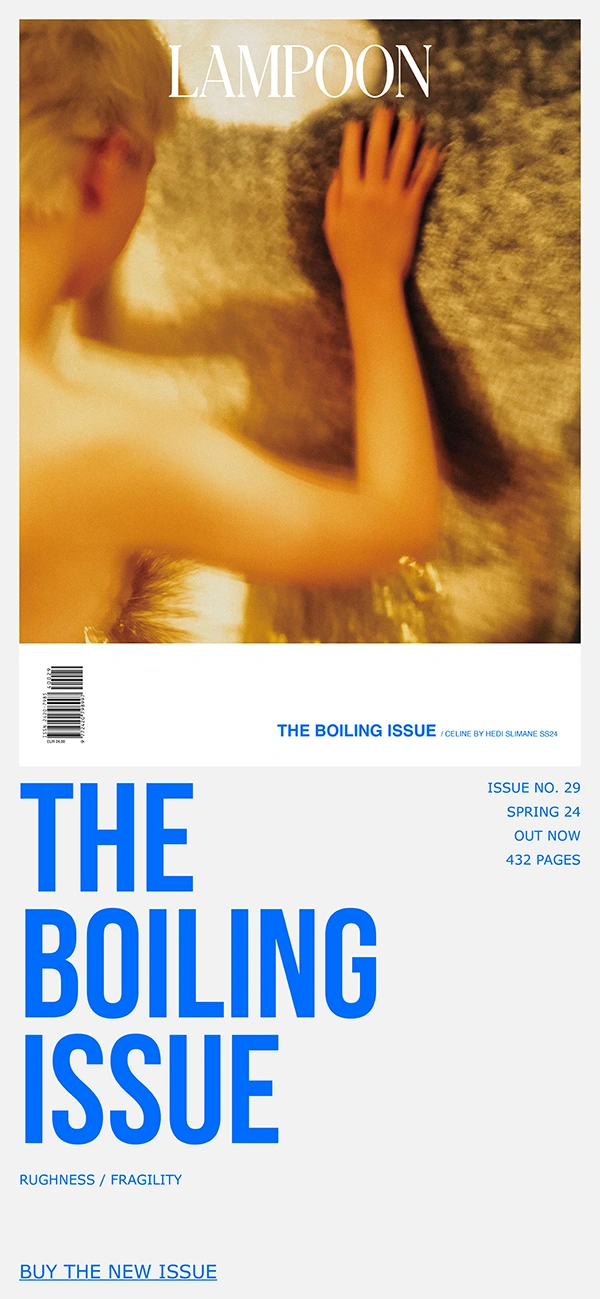
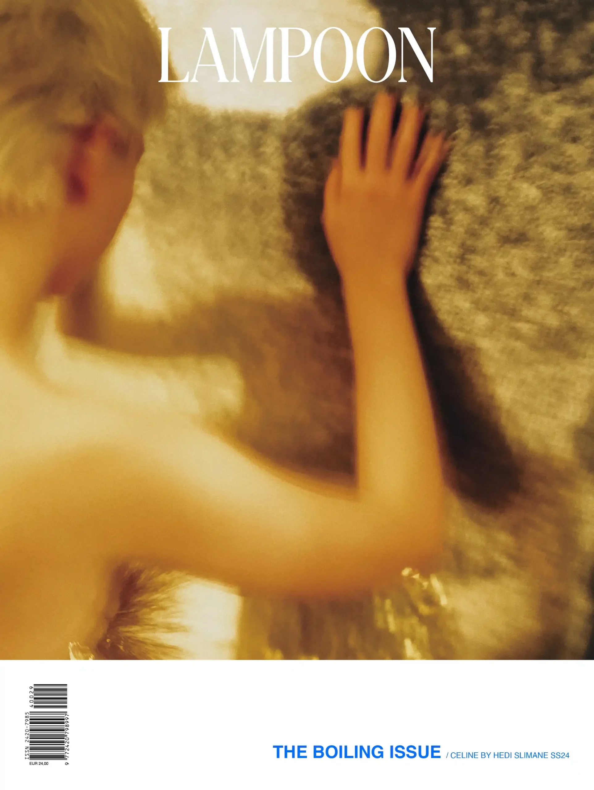
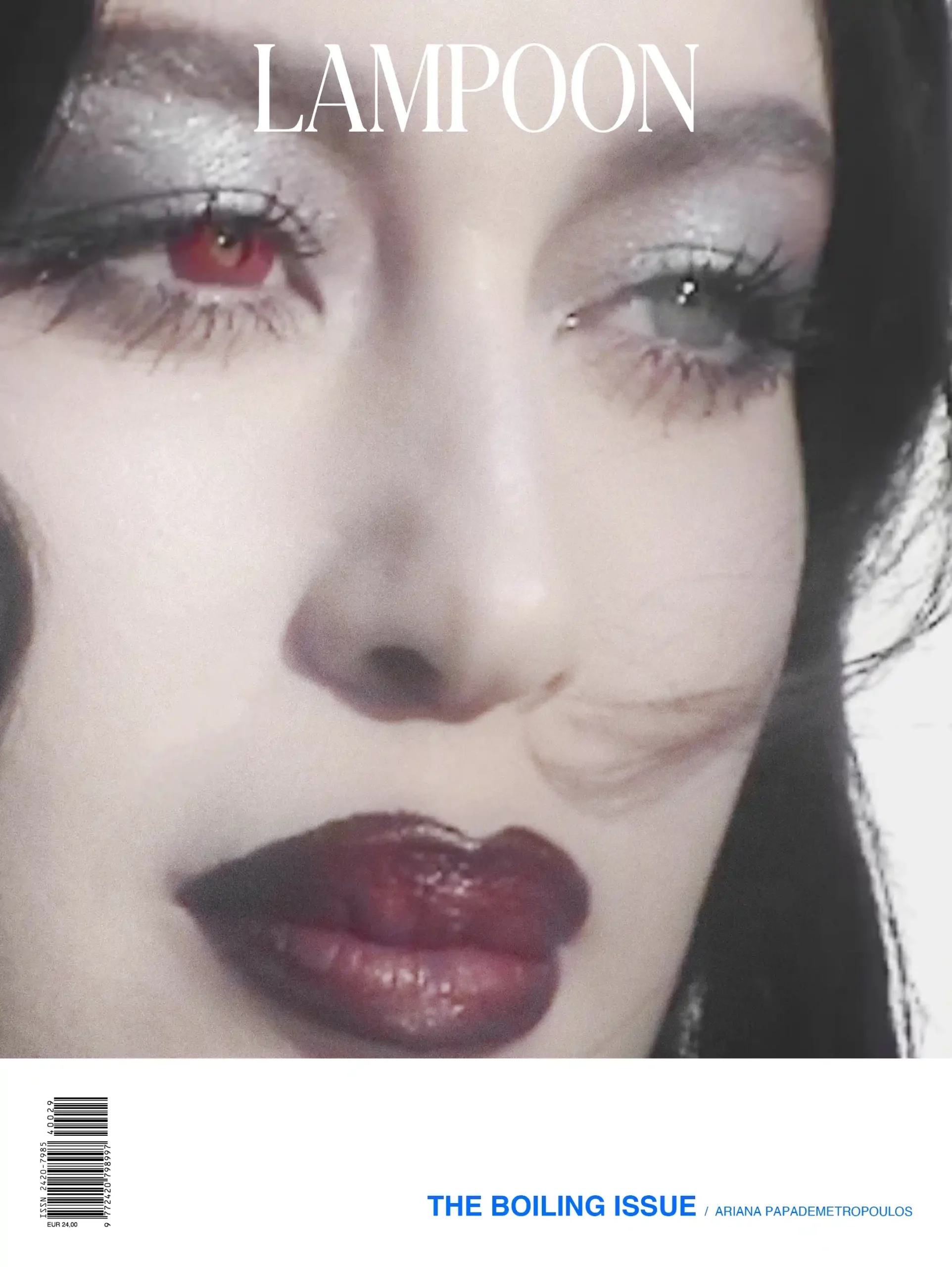
«My intention was to make something beautiful and classical and then figure out how do I f**k it up? Make something pretty, but layer it by inserting rawness»
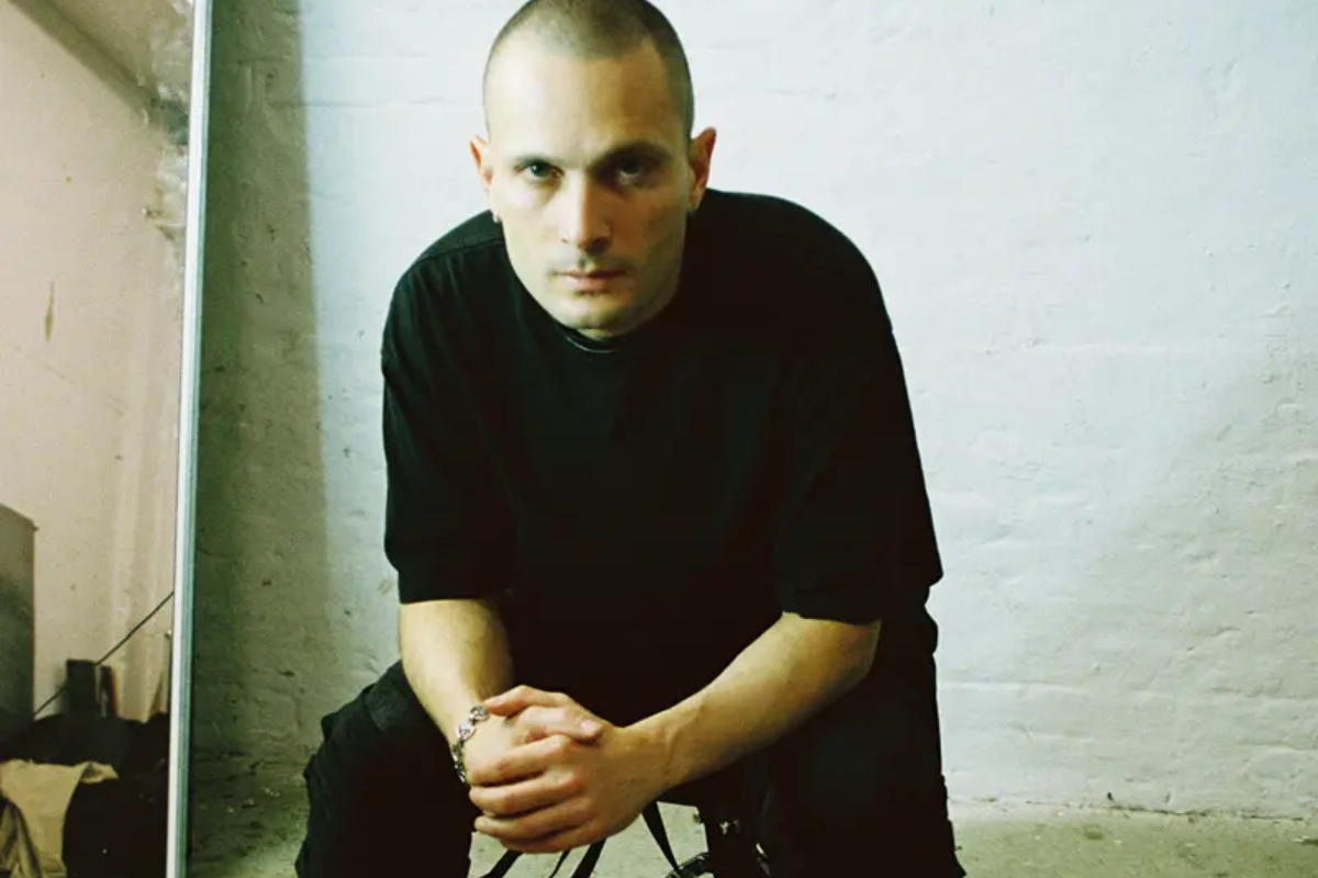
Gary Card: pop-culture art
Not pop-art, but rather pop-culture art, this is how British creative, Gary Card titles his brand of work; though his style has been attributed with adjectives such as psychedelic, dreamlike and fantasy-led. The wacky in Card’s designs stem from his approach and process. As a set designer, his vocabulary doesn’t include the square foot metric. He is a creator whose ideas are driven by limitations.
While still awaiting USP-status, Gary Card’s medium of choice is masking tape – from headpieces and sets to figurines and sculptures, the rawness of this material will soon be synonymous with his narrative, which is often driven by the vision to appear ‘in process of.’ Evidence lies in his employment of unusual materials to craft sets, including hair gel and guacamole. Through immersive spaces and peculiar objects, Gary Card hopes to build an audience that resonates with his singular vision and each creation invites viewers to contemplate the role of imagination in our lives.
Lampoon in conversation with Gary Card
Gary Card: I was obsessed with the Homogenic album cover by Nick Knight and Alexander McQueen.
That was the spark for me – ancient and contemporary colliding as a concept, creating something startling. It was radical that old and new could come together in such a way. That’s when I knew that I wanted to be involved in pop-culture media.
I remember thinking: who did this – Alexander McQueen, where did he go to college – Central Saint Martins. That meant I had to go to Central Saint Martins. All of my studies and focus went into escaping my seaside town and moving to London to make pop-culture art, not pop-art.
I wanted to be a part of vital pop culture in the same way that Björk, Nick Knight and Alexander McQueen were.
Central Saint Martins or nothing for Gary Card
GC: Theater design seemed like a way of experimenting with different disciplines. There was costume design that included fashion design, drama, acting, writing. Stage design meant painting, fine art and sculpture combined– all of these things are theater. I studied them knowing that I would never do theater. I wanted broad strokes of different disciplines to give me an idea of how to navigate my future in the arts.
I got a job as a graphic designer, then a shoe designer. I was also moonlighting as a freelancer making headpieces for magazines. Those headpieces evolved into sets, and I found myself being called a set designer.
My career has allowed me to shift, change and do different things. I only do jobs I find interesting. I’m known as a set designer, but that’s not how I see myself. Set design just happens to pay the bills. What I’m passionate about is sculpture. People would wear my sculptures or shapes – on their heads or their bodies. I thought about shapes more than anything else; making exciting shapes and then identifying how people interacted with those shapes. I’ve been making masking tape sculptures for about twenty years.
Gary Card’s artistic narrative
Aarushi Saxena: What is Gary Card’s artistic narrative? How would you describe your visual vocabulary?
GC: As a set designer, your role is to constantly move and shift, to be malleable to whatever the theme or circumstance the new job reveals. As an artist, it’s about finding your voice and what it is that you want to say. Right now, my visual vocabulary is fluid. That being said, I like limitations. If someone told me do whatever you want – I feel the lack of limitations, because where do you begin.
AS: Limitations drive the birth of your ideas.
GC: What can’t we do – that is what drives me. For Lampoon, it was shooting on film. This inhibited the process. In a way, it lent the project a new quality, something that wouldn’t have been explored otherwise. Now there’s something real or raw to it.
My process as an artist hasn’t changed much. At the moment, I approach galleries the same way I would an editorial. I ask them – what do you want, what would you like. I would love a gallery to commission an entire installation out of avocado or something.
Gary Card on rawness and his approach
AS: What does rawness mean to you?
GC: Things that are unfinished, with the status in the process of. Sometimes, we build a set and I much prefer the way it looks from behind. Often, the construction appeals more than the finished result, it tells more of a story, there’s mystery to it. Rawness means process, it means tactility, I would always choose rough over shiny.
AS: Has the transition from fashion to the larger playing field of art, changed your narrative, approach or even pool of inspiration?
GC: Over the years, as a set designer, I’ve been told by the photographer that the concept has shifted, rendering my set obsolete. This would break my heart; the fashion industry is fickle. I’ve had years of these kinds of experiences, where I’ve had to give so much love to a set build only to have it discarded. Often ideas of a set designer go through the filters of a stylist, creative director, hair stylist, makeup artist and a photographer. The original concept can become compromised.
Now, I do my own work, that’s all mine – and that’s what this change is about. It was not about becoming a fine artist, that’s not what I’m trying to do. I want to explore my own voice.
My journey as an artist is now about autonomy. I’m not a trained sculptor or painter in the classic sense. I have enough honed instincts, experience and enough pig-headed determination. Making something that could get chucked out because the concept has shifted doesn’t upset me like it used to, that’s not my whole world anymore. It is still part of it, but now I also get to go home and make my painting or my sculpture.
Hysterical by Gary Card and his goals for the future
GC: I did a show a few years ago, called Hysterical. It was curated by me and based on cartoon iconography within contemporary art. The idea was to bring artists together, from Paul McCarthy, George Condo to Peter Saul and Takashi Murakami, and find a common thread in the cartoon iconography their work examines. In the end we collaborated with Phillips, which meant we had an archive of work by the world’s most exciting contemporary artists.
The challenge was to make an entire world around this concept, through an immersive set that would re-contextualize these artists’ works, without suffocating them. The gallery we collaborated with was vast. There were pockets and nooks where people could walk through the installations. People experience the work and the space. It was the first time my experience as a set designer and my aspirations to be an artist came together, a chance for me to reflect on where I’d been and where I wanted to go.
My creative goals at present are about making the artwork work. I’ve been making my own art for about five years and people are starting to take notice. There are upcoming projects and talks in Hong Kong, Japan and London. Total autonomy is my ultimate goal. One day, I will no longer be a set designer. It is about legitimizing my art work: to be able to create for an audience that I have built, who appreciate my singular vision.
Gary Card for Lampoon – the RuVido Issue
AS: Can you talk me through an unembellished version of your process – from concept to completion.
GC: It depends on the kind of project coming my way. Lampoon was a particular type, where I was asked for original artwork. It starts with research: looking at books, going on Pinterest and Instagram – banal things that everybody does. I cherry-pick inspiration from different worlds, sometimes it is contemporary, sometimes classical. Then bring these elements together.
I tend to make folders of images, which I agonize and pore over. Lampoon’s folder consists of four-hundred images. I narrow it down to around fifty images and try to identify which of these images speak to me. From there I try to distill it into a top five or ten images that encapsulate what I hope to create. I then go back to the original file of visuals to find details.
My favorite stages of set design are receiving the project and then seeing it completed at the end –everything in between is a nightmare. I’m far from what you would call a technical person; I’m instinct led. One of my least honed areas in work is estimating any kind of size or scale. I can tell you how big I want something, object or space – but I’ll show you with my hands. I don’t have metric; it is all about the gestures.
Figurative objects: a classical body in a radical skin
AS: What is the story behind your move to fantastical toys and reimagined classical sculptures?
GC: Figurative objects are and have always been exciting to me, whether it is a traditional statue
or an action figure toy, I see equal value in both. I’m doing a show in Hong Kong, where we are exploring the relationship between Chinese deities and disposable bootleg toys. It’s the juxtaposition of something classical, with something disposable and a finding of the middle ground.
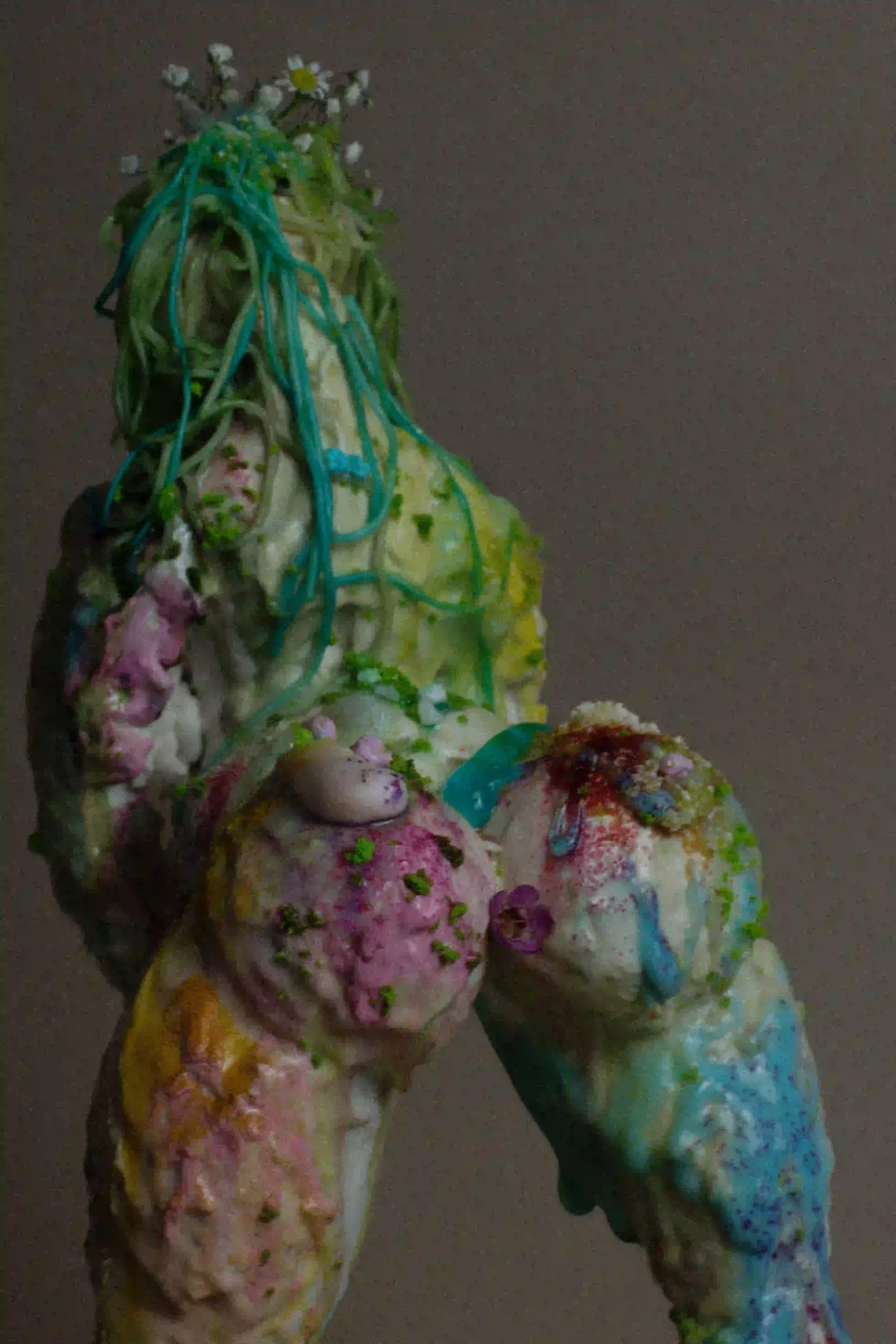
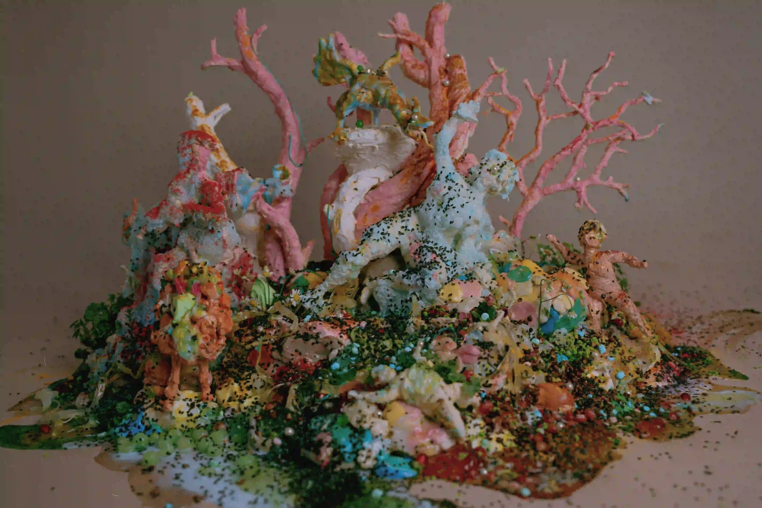
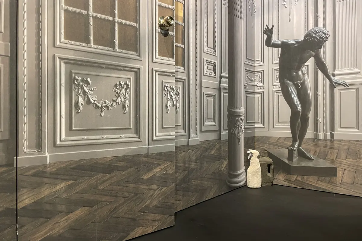
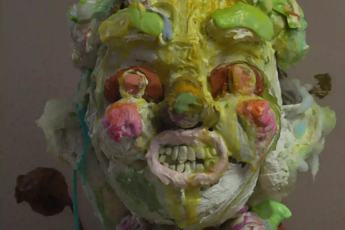
I love exploring a classical body, but in a radical skin. I’m making classical sculptures, but I’m exploring wasabi, guacamole, toothpaste, mustard, mud, hair gel, chewing gum and of course masking tape.
They need avocado, they need color: Gary Card
GC: My intention was to make something beautiful and classical and then figure out how do I f**k it up? Make something pretty, but layer it by inserting rawness, because no one wants to look at just pretty. It started with masking tape shapes. The final photos were to be shot on film, I knew that I wanted these pictures to feel like there’s a living spirit going through all of them, otherwise we’d just be shooting ornaments, and that felt like a missed opportunity.
I didn’t want to shoot anything too rigid that could end up creating passive photos. To infuse that living spirit, my concept was making abstract, in process visuals, where the textures were wet, tactile, real and fluid. So, it looked like there’s a lot of direction, where materials are sliding, or oozing into one another making different marble textures. There was a process of going from one form to another and a sense that this was going to be primordial in some way. I’m drawn to color and it’s not in my control. Color doesn’t drive me; it’s a side-effect, a result, a consequence. I asked myself how do I make these sculptures come alive? They need avocado, they need color.
Gary Card
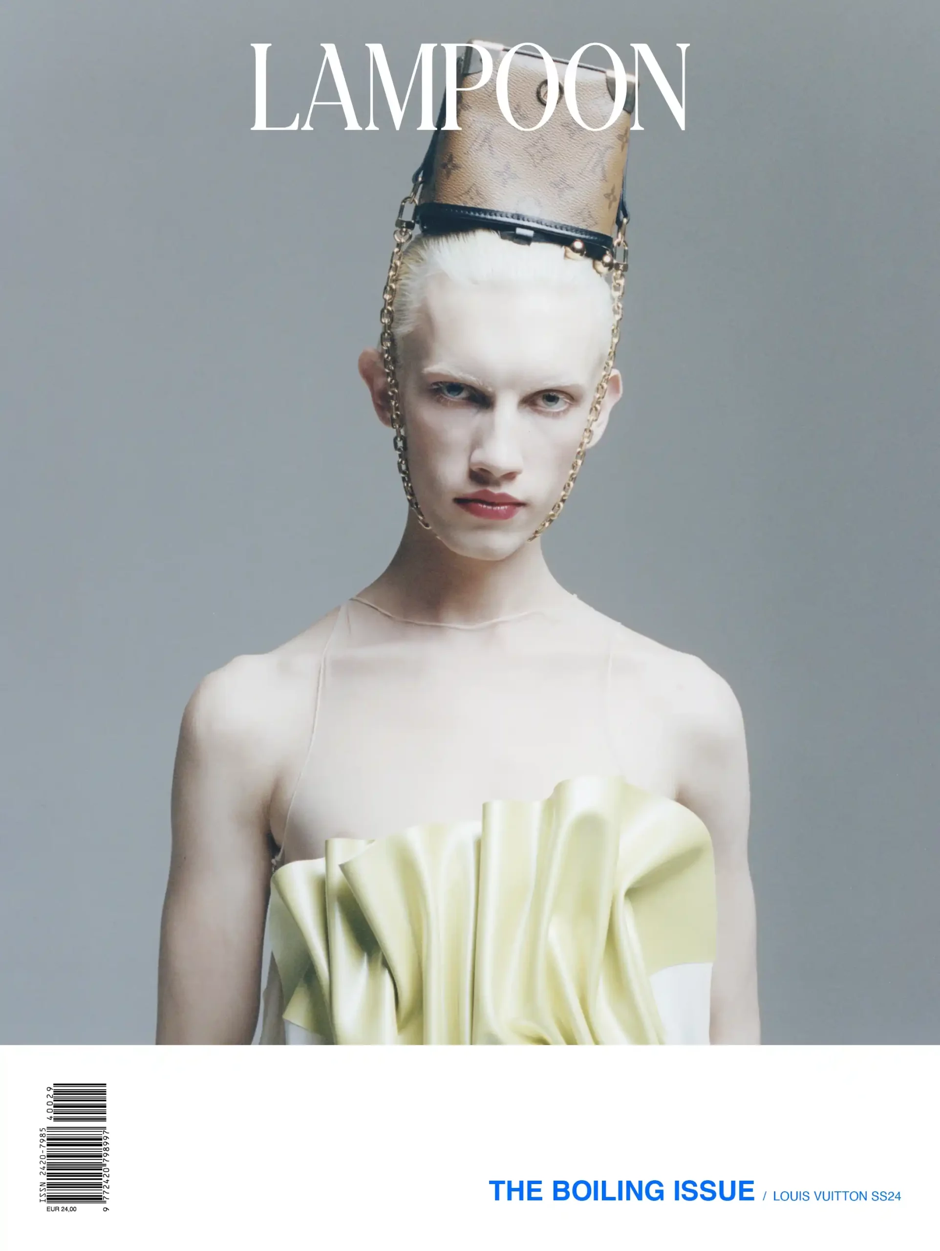
Gary Card is a Bournemouth born artist, set designer and illustrator based in London. Best known for his work within the fashion industry, Gary has created works for the likes of Comme Des Garçons, Dover Street Market, Nike, LN-CC, Hermes, Louis Vuitton, Vivienne Westwood and Charles Jeffrey Loverboy.
Aarushi Saxena