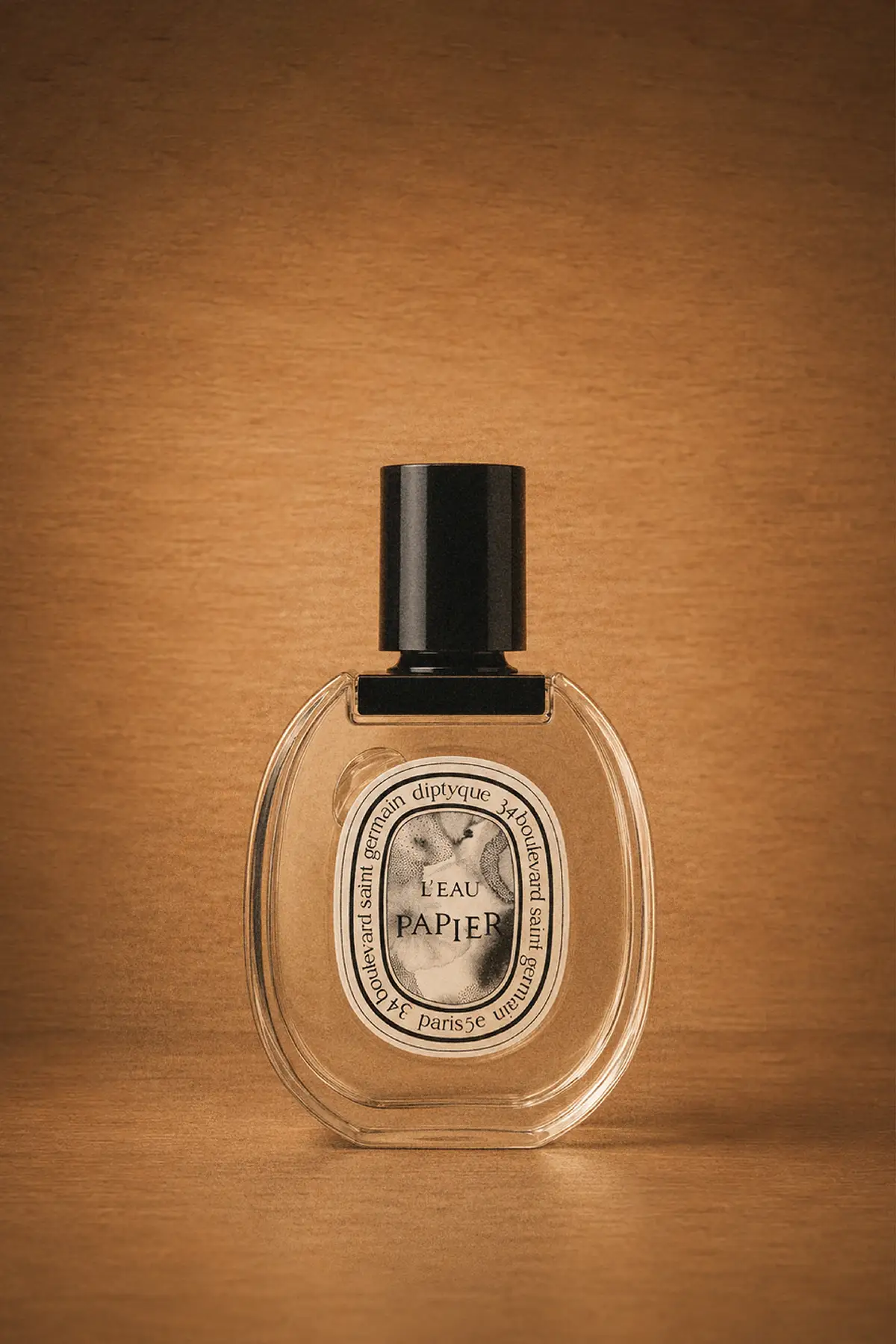
L’Eau Papier by Diptyque: diluted ink permeating a blank page
Fabrice Pellegrin created L’Eau Papier as he would write a book: sesame in the form of roasted seed extract – this element evokes the scent of ink
The origin of the Diptyque artist collective in 1961 at 34 Boulevard Saint Germain
In 1961, three close friends – Christiane Montadre-Gautrot, an interior designer, Yves Coueslant, a theater set designer, and Desmond Knox-Leet, a painter – came together to express their passion for art and design by embarking on a new venture. They stumbled upon an empty shop at 34 Boulevard Saint Germain in Paris, featuring two windows at the side of the entrance.
Through their architectural knowledge, they recognized this design as a diptych, which is known as ‘diptyque’ in French, inspiring the name for their budding enterprise. At 34 Boulevard Saint Germain, they offered printed fabrics, Indian incense holders, German paper lanterns, and other one-of-a-kind items. However, it wasn’t until 1963, marking their second anniversary, that they introduced scented candles, igniting the essence of Diptyque.
Diptyque, introducing fragrances through visual expression
Allowing imagination to navigate across the canvas. This is a process that characterizes artistic creation, and that the founders of Diptyque aim to persue. Their perspective is rooted in visual expression, contributing to the narrative and composition around their perfumes.
The creation process of the new fragrance L’Eau Papier exemplifies this approach. It began with a white canvas and a stroke of a black brush, uniting two elements: a nose and a hand. Sight and smell converge.
L’Eau Papier, Diptyque: a tribute to artistic creations on paper
L’Eau Papier pays homage to creation, the foundation of the Maison, and to paper, the primary medium of expression. Paper triggers imagination, with the emergence of drawings, liberating individual creativity and recalling memories.
The name of L’Eau Papier unites water and paper, recalling the Maison’s history and the founding trio’s passion for artistic expression. It evokes diluted ink permeating a blank page, bringing forth shapes, the act of an artist composing.
[envira-gallery id=”132621″]
L’Eau Papier, Diptyque. The composition of the fragrance: ink and paper notes
L’Eau Papier‘s olfactory composition is a manifestation of perfumer Fabrice Pellegrin’s vision. He compares creating a perfume for Diptyque to writing a book, where all the elements must come together to form a narrative. A story with an introduction and a structure.
For L’Eau Papier, Fabrice Pellegrin’s starting point was one ingredient: grain. Sesame in the form of roasted sesame seed extract. This element, according to Pellegrin, evokes the scent of ink. Musky notes were also incorporated.
To complement the paper-like note, floral mimosa notes with powdery properties were introduced. The combination of the cereal and ink accords, harmonized with white musks, captures the essence of paper.
The design heritage of Diptyque: ancient temples and Roman shields as inspiration
Desmond Knox-Leet was the mastermind behind the brand’s aesthetic, and little has changed over the years. The font used for the brand’s name on the label embraces a non-linear structure and design. Instead of being displayed in a regular, straight line, the letters appear to be dancing or moving, creating a playful visual effect.
Part of this inspiration came from the architectural form of ancient temples, while the rest was influenced by Desmond Knox-Leet’s previous work as a codebreaker during World War II. Consequently, consumers are invited to decipher the perfume’s name themselves, adding a layer of mystery to the product.
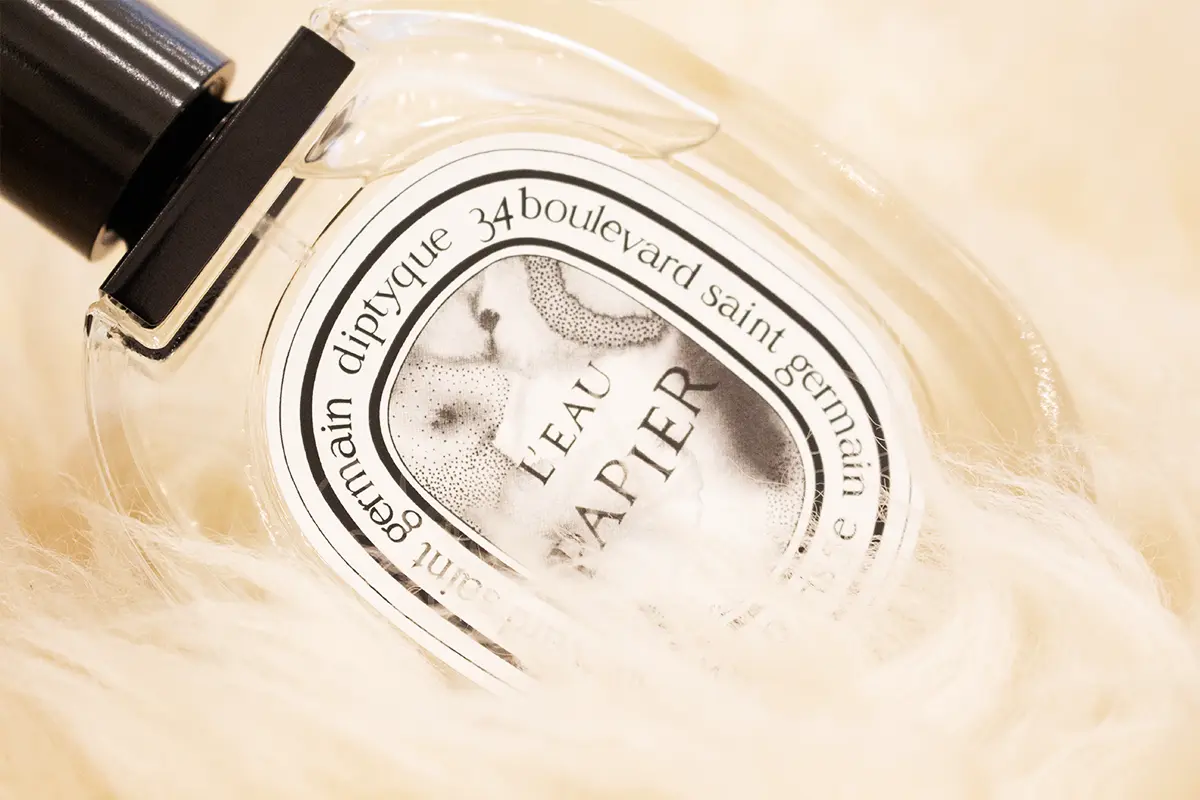
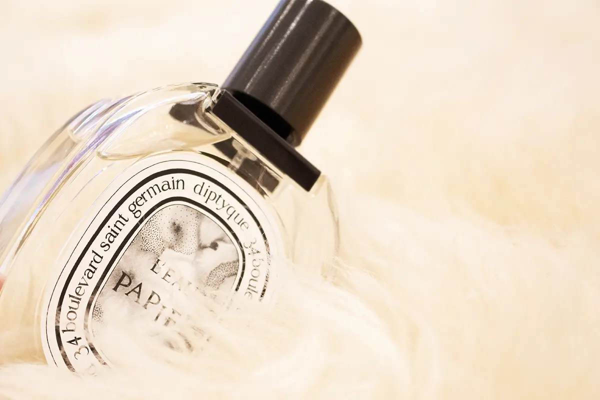
The idea for the oval-shaped labels was drawn from ancient Roman battle shields, a design element that had already found its way into some of Diptyque creations. On the reverse side of the label, if one peers through the liquid, an illustration relating to the fragrance can be discovered.
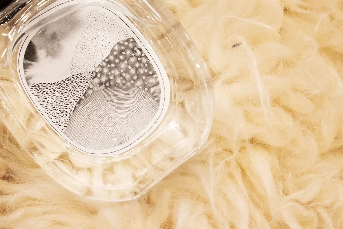
The illustration by artist Alix Waline reflects the composition of L’Eau Papier
L’Eau Papier by Diptyque was developed in collaboration with perfumer Fabrice Pellegrin and artist Alix Waline, a French artist trained at the Beaux-Arts de Paris and the École de la Cambre in Brussels. Alix Waline crafted a black and white piece, developing the drawing dot by dot and layer by layer. Unlike traditional illustrations for Diptyque perfumes, her work is not centered around recognizable figures or scenes; instead, it presents an impressionistic, abstract composition in black and white.
Decoding Alix Waline’s illustration on the label’s front and back
Alix Waline’s drawing on the label’s front showcases intensities of inking. Each viewer is free to interpret the artwork according to their own imagination, bringing stories to life. In this moment, the observer becomes the creator, whose imagination takes on a commanding role.
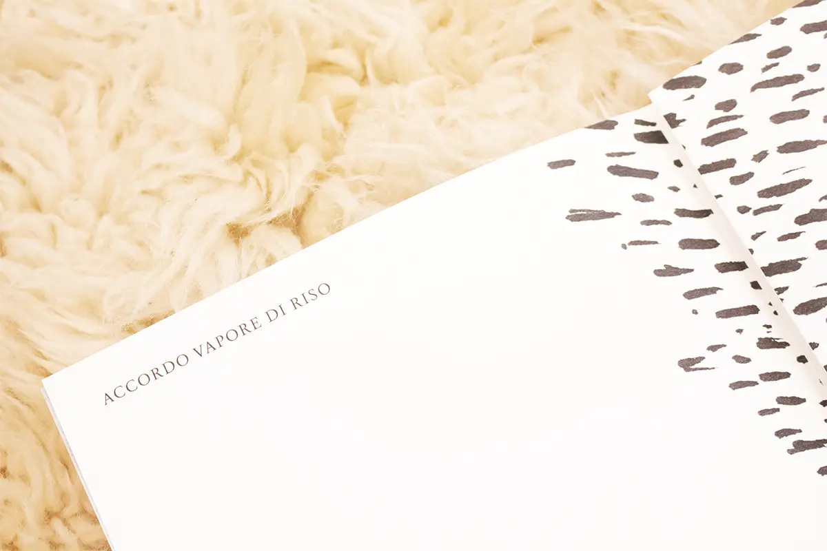
Resonating with the pointillism that shapes the style of Diptyque illustrations, Alix Waline’s drawing on the label’s back is a portrayal of her interpretation of the perfume’s olfactory notes: white musks, rice steam accord, mimosa, and blonde woods.
Through the usage of an ink wash technique, the artist captures the essence of paper grain and white musk. The arrangement of knit strokes mirror the texture of rice paper, a traditional medium for drawings. To represent the woody accord, furrows are employed, as wood represents both longevity as well as the material for paper creation.
Lastly, the application of ink dabs evokes a mimosa note, giving an additional hint of sweetness to the fragrance. The result is a musky woody Eau de Toilette that translates the contact of ink on paper.
L’Eau Papier, Diptyque
L’Eau Papier pays homage to creation, the founding value of the Maison Diptyque, and to paper as a medium of expression. The fragrance was created in a collaboration between perfumer Fabrice Pellegrin and artist Alix Waline. Mixing notes of grain, sesame, musk, and mimosa, the aim was to evoke the scent of ink on paper. As a consequence, Alix Waline’s drawing on the label showcases intensities of inking.
Giulio Polverigiani