A scented flipbook, containing slits of images, sketches, and notes. The verbiage in the book is immediately accessible, in a Pantone like format
Samuel Ross for Acqua di Parma
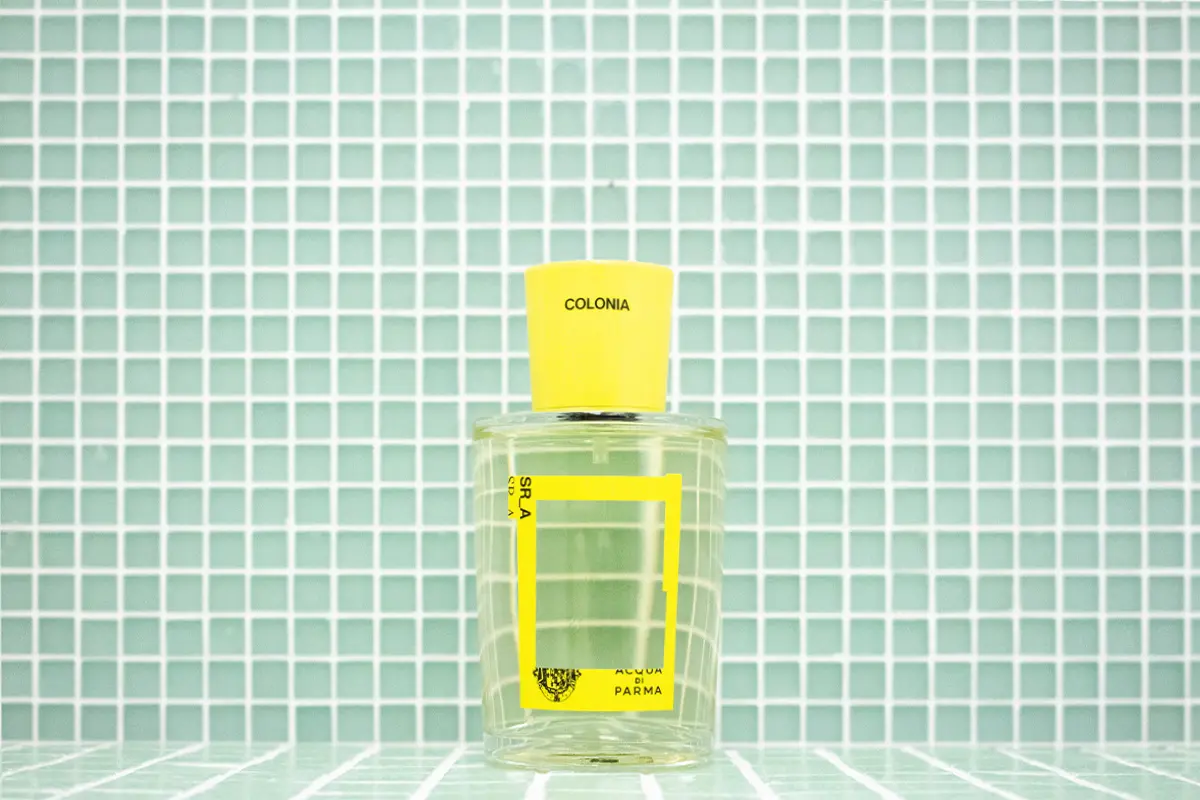
Milan’s streets are currently adorned with billboards displaying the cologne collaboration between Samuel Ross, a London-based designer, and Acqua di Parma, the Italian fragrance house. The image of the orange high-fluorescent bottle pops-up on the bus stop on via Eustachi in the Porta Venezia area for instance.
The bright silhouette almost mirrors back on the marble landscape of that street, reflecting Ross’s meticulous design approach and his commitment to ethical and inclusive conversation.
Aqcua di Parma: brand narratives in a socio-geographical element surrounding leisure and movement
The collaboration «started before it was actualized» as explained by Ross. He had been following the «work of the maison Acqua di Parma for a while now, as an example of how brand narratives are inscribed in a particular socio-geographical element surrounding leisure and movement. This element is the core in terms of how one articulates space and environment through the lens of luxury, and this is very evident in the barber space that the maison has in the department store Selfridges in London».
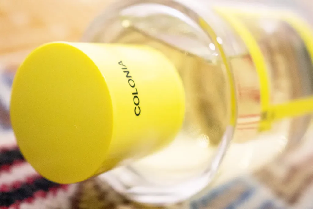
Samuel Ross: high-fluorescent tones and
Samuel Ross’s research into the brand’s behavior led him to focus on two main elements for the fragrance. The first was the use of high-fluorescent tones, which are more intense than the mid tones typically used by Acqua di Parma.
These tones «reflect the industrial process of highways, red and yellow stripes on the back of an ambulance, beware signs, or double yellow lines». Ross added, «the interior of the label was removed to allow the liquid to show through, enabling the liquid to magnify what you see and how you experience space».
The Acqua di Parma bottle design: Samuel Ross
The second element was the bottle itself, which «looks like the entrance to a building, the silhouette of a landscape building, or an architectural piece by Richard Rogers. The notion of feeling like a piece of scaffold was also taken into consideration, making it a tangible intervention into what you look for. All of these different connotations were compounded and compressed into an intense experience that is visible for about five to seven seconds online, or maybe ten to fifteen seconds in a store at first».


Samuel Ross’s practice
Samuel Ross’s practice SR_A is part of a body of work that Ross has been developing in London. His approach also translates in the brand he founded A-COLD-WALL*. His work is influenced by his upbringing in South London, where he was exposed to street cultures and high fashion.
Ross’s inspiration also comes from his interest in architecture and industrial design. He takes inspiration from the clean lines and functionality of buildings and translates them into his clothing designs. His designs often feature bold lines and geometric shapes, creating a striking and modern aesthetic.
Acqua di Parma’s relationship to the city Milano
SR_A wanted to keep the same type of weight and density and finish on the glass, as well as the recognisable silhouette. However, they also wanted to push forward the notion of Acqua di Parma’s relationship to the city representing Milano, and the ideas of «what it is to operate for a city, to work in a city, to live in a city and what you are exposed to in those experiences. Temporary facades and temporary architecture such as scaffolds became a way to visualize the 24 hour cycle of how we operate within a city».
Ross also wanted to find a way to bridge the relationship between Milan, London, and Paris. Ross highlights, «we found similarities in terms of visual systems and architectural systems that could translate in a simple and meaningful way into the visual system for the bottle. The limited edition fragrance piece is a pillar to Milanese culture and a testament to the relationship between luxury, space, and environment».
Samuel Ross: the role of a designer operating in non-essential goods services
In his work, Ross also questions the role of a designer operating in non-essential goods services’, as someone who «focuses on world building and visualization cadences of a digital/physical experience. Asking ourselves: how can design pull out curiosity from its viewers?».
Ross’s approach acknowledges the language in communicating ideas, but also recognizes the potential limitations of complex sentence structures. He mentions «using a particular vernacular may only speak to a small percentage of people, and in a commercial space, to use language that is accessible and enjoyable». This approach is evident in his work where the language is immediate, macro-facing, and incites playfulness and wit.
The scented flip book: Samuel Ross for Acqua di Parma
One of the products derived from this collaboration is a scented flipbook of around three centimeters containing slits of images, sketches, and notes. The verbiage in the book is immediately accessible, in a Pantone like format.
This use of language as a tool for curiosity and accessibility is a recurring theme in Ross’s design philosophy. He also draws inspiration from his readings in anthropology and history as well as his fondness for luxury maisons as time banks or incubators of history. Ross’s work attempts to look into old ways of communicating and creativity can be recontextualized for contemporary culture.
He mentions the use of sonnets and haikus, as linguistic tools that can be modernized and brought into the present day. A Haiku is a traditional form of Japanese poetry consisting of three lines. The first and third lines contain five syllables, while the second line contains seven syllables. Haikus typically focus on nature, seasonal changes, or human emotions, and often include a cutting word, which serves to create a pause or break in the poem.
The goal of haiku is to capture a moment or feeling in a concise and vivid way, using simple and concrete language. Ross’s work reflects this philosophy, with its emphasis on accessible language and playful design that sparks curiosity in viewers.
Samuel Ross
Samuel Ross is a British product and fashion designer, creative director, and artist who was born in 1991. He is most known for co-founding the fashion company A-COLD-WALL* and collaborating with companies including Hublot, Off-White, Oakley, Nike, and Barney’s.
Acqua di Parma
Acqua di Parma, founded in 1916 by Parma’s baron Carlo Magnani as his personal Perfume, is now a hallmark of Italian finesse, understated luxury, and workmanship that is inspired by its tradition while continually developing to be current and significant.
Ibrahim Kombarji