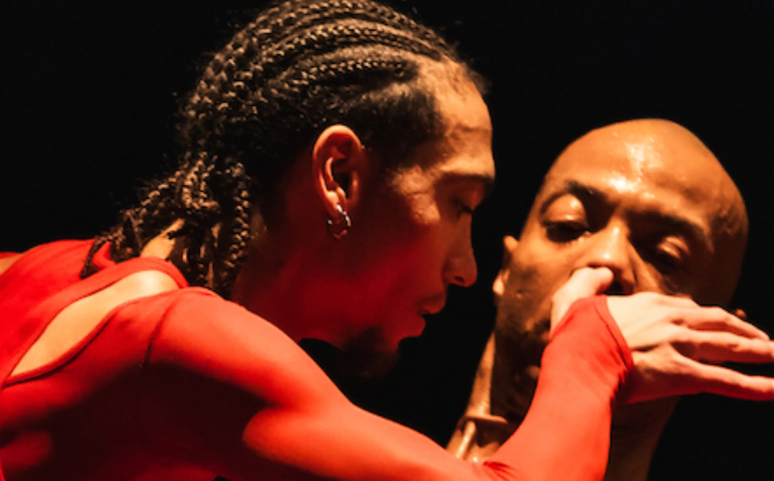
François Berthoud: mistakes are one of the things digital tools can’t offer
Blending traditional tools and contemporary technology, artist illustrator François Berthoud carves linoleum plates by hand, uses vegetable-based ink and plays with net distortions, celebrating process over product
The art of linocut printing and handmade techniques in fashion illustration: an interview with François Berthoud
I don’t use a single technique, but my trademark is linocut printing – François Berthoud starts explaining. I started working with it during the time I moved from comics to fashion illustration. I was looking for a distinctive line. I made some comics by carving drawings onto film, creating negative lines that I could ink and print on paper. The result convinced me, and I realized I was imitating engraving. Over time, the technique evolved, and I started using a printing press.
Today, I start with a drawing that I transfer onto a piece of linoleum – a natural material made from linseed oil and backed with jute fabric. I carve the plate by hand and ink it with a roller. I use oil-based inks, meaning they are made with vegetable oils and added pigments. The color is transferred from the linoleum plate to paper using a press, often in several layers. During printing, I can ink the plate unevenly or play with off-register effects.
Another technique I have experimented with is dripping. I stopped using it because it requires a toxic varnish that gives off harmful fumes. There is a non-toxic, water-based alternative, but it is less thick and lacks the viscosity needed for this process. Still, I use a few grams of color on each sheet of paper, so the impact is low. My work is done by hand, and I consciously choose to produce a small number of pieces.
From Gutenberg to Mac: centuries of drawing tools in one artist’s studio
François Berthoud: In my studio, I have tools for creating images that span several centuries. There is a printing press – the descendant of Gutenberg’s movable type – and an Apple Macintosh. On my desk, there are brushes, rulers, and compasses. Since I like technique, I am open to using any tool, so I had no problem working with the computer, especially once it became possible to manipulate fonts. I also use a scanner to process my drawings digitally. For the Zurich Opera House, I created posters by layering hand printing with scans and computer editing.
Artists have used new tools throughout art history. Right now, I don’t even want to look at the computer anymore. I am glad I no longer have to do software updates. I prefer to let someone else handle that part. I have had a good relationship with digital tools, but – though it may sound obvious – handmade work has a deeper dimension. There is a moment when the hands start thinking for themselves: I can get lost in the process, and they just move on their own.
You can recognize artisans by their calmness. They have inner balance because they use both mind and body. My eyes can guide a carving with millimeter precision, while my hand can feel the tiniest changes in the surface. When the conditions are right – when things are calm – it is a pleasure to lose myself in this kind of work.
The beauty of imperfection in handcrafted prints and experimental techniques
When I make a print, I set up the materials to create the right conditions, but the final result appears when it is printed. Some steps can be controlled, others are unpredictable. I like to work with that lack of control. I create a situation where something unexpected might happen. Sometimes the color turns out differently from what I imagined – and it can even be better. Mistakes make the work come alive. I used dripping in my portraits to bring out the life of the person portrayed. When there is imperfection, the illustration feels more human, more alive than when it is perfect. Mistakes are one of the things digital tools can’t offer: François Berthoud states.
To do the dripping, I work on a semi-transparent acetate sheet, with a reference image – like a photo – placed underneath. I sketch the essential lines of the image on the acetate. Then I follow those lines with a thick, sticky ink. I press a sheet of paper onto the ink, and it picks up the print. I can repeat this process several times. It is a technique based on the drying time of the paint: if I wait too long, the paint dries and won’t transfer; if I wait too little, the paint spreads too much and the shape is lost. If it doesn’t work, I start over.
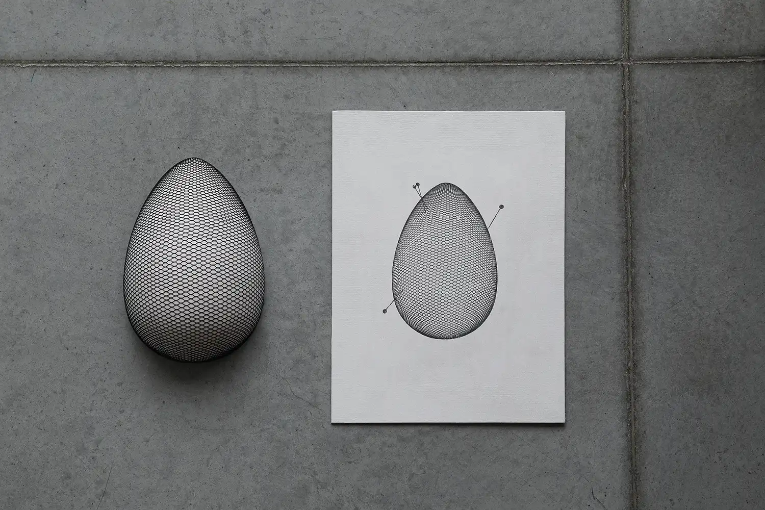
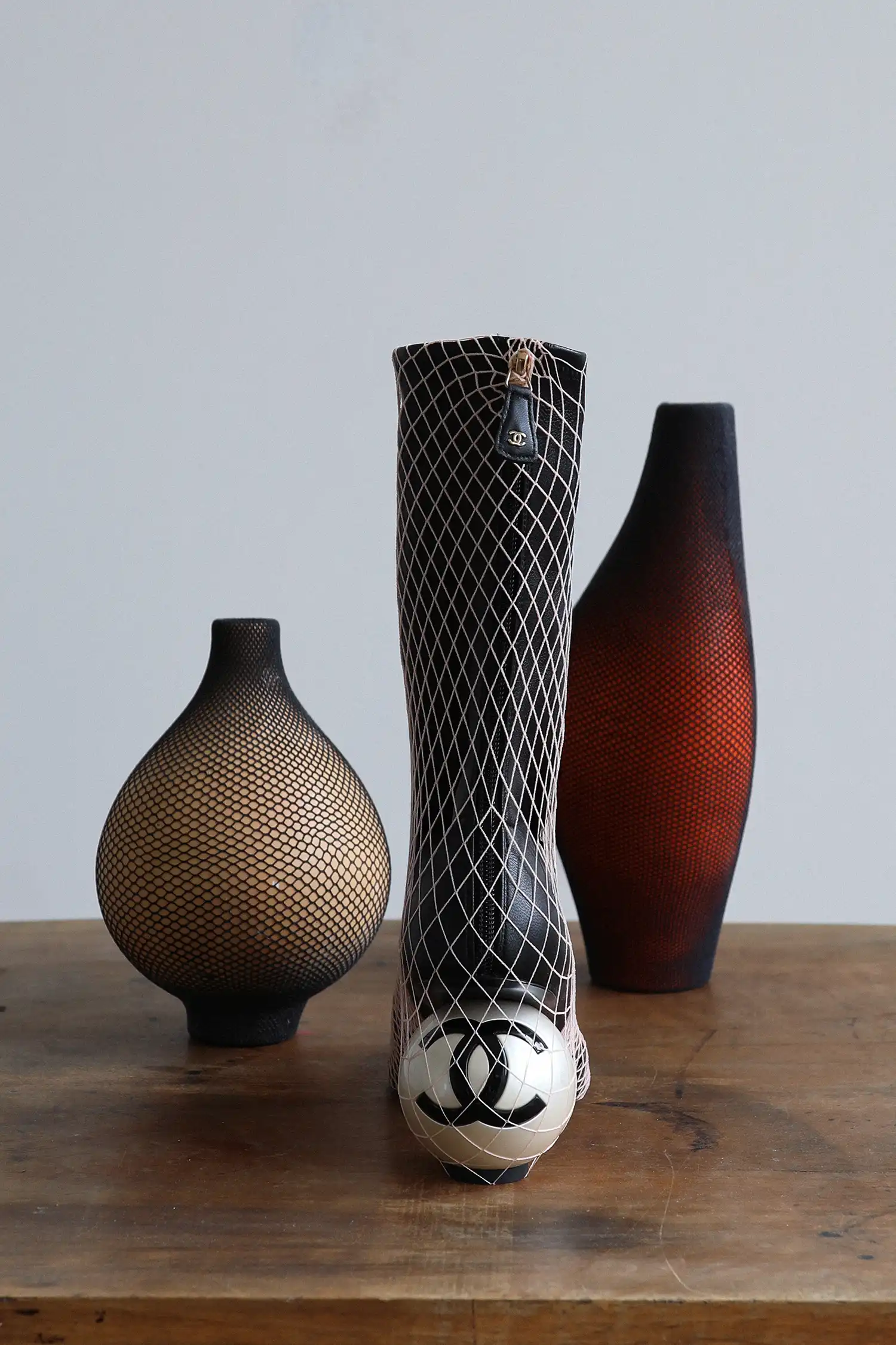
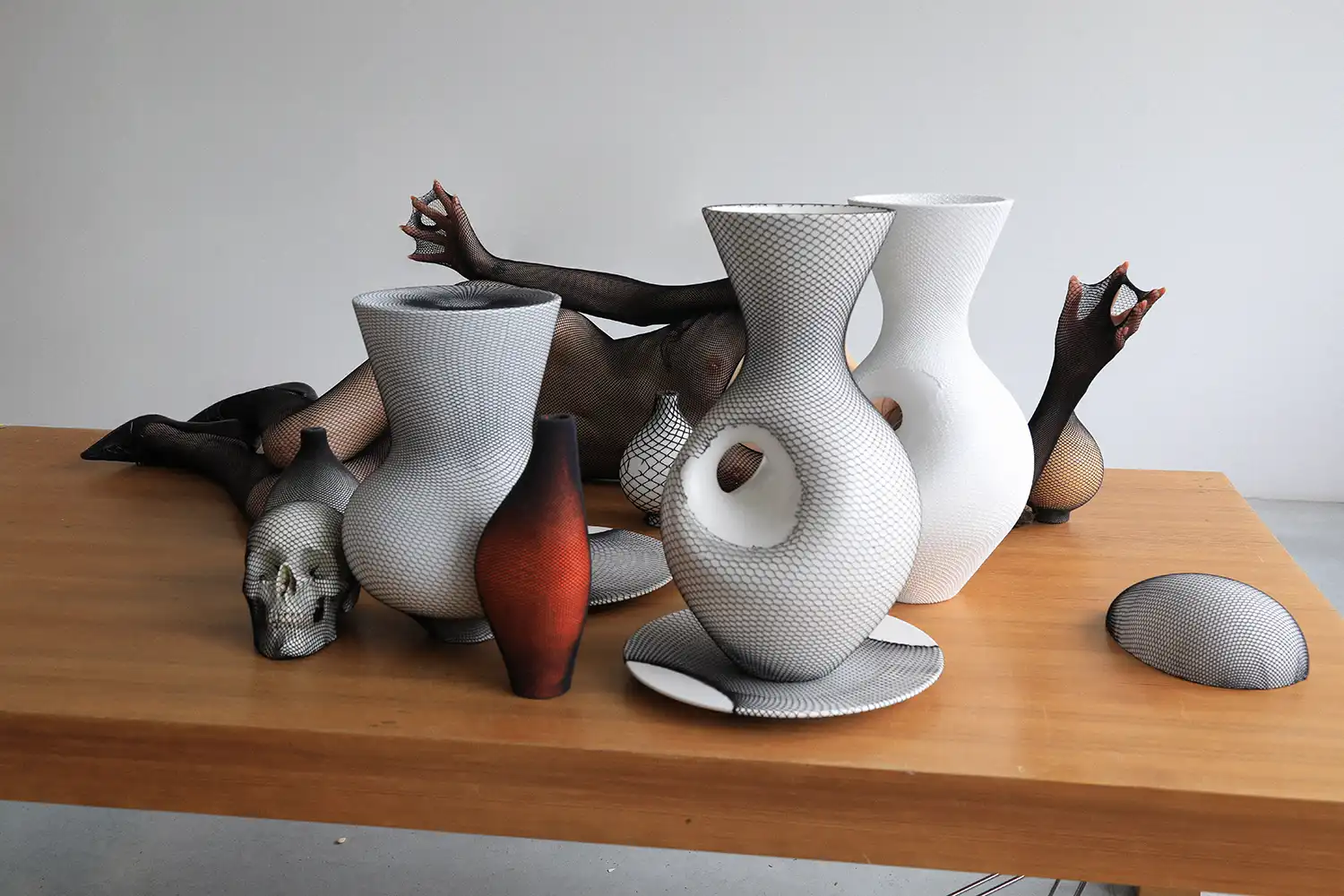
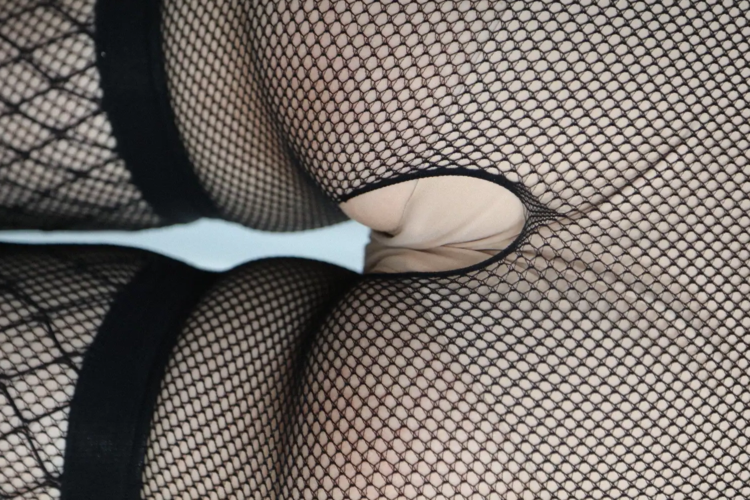
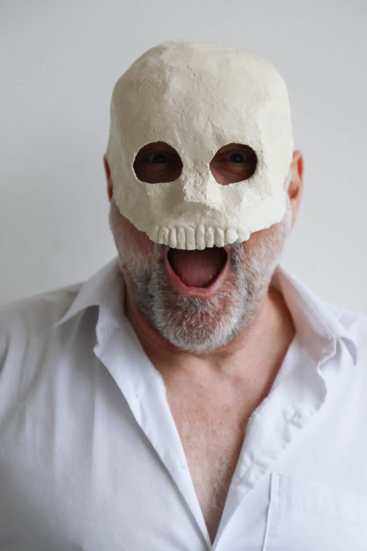
Right now, I am also making white sculptures covered with a black netted fabric. The vases are ready-mades, but the other objects are not. These sculptures are both objects and subjects, because once photographed, only the netting is visible. It is a way of drawing without actually drawing. The result is different depending on how the net stretches and fits the shape of the object. The net might follow the form closely, or like with the skull, it might stay suspended over hollow areas. In the photos, the net’s lines appear over the white shape – a texture that would be hard to draw by hand.
François Berthoud: eroticism in fashion illustration: seduction, linework, and cultural references
Fashion is a tool of seduction, it has an implicit erotic nature, says François Berthoud. Through Anna Piaggi, I became interested in the culture of clothing and costume. Thanks to her, I met her husband Alfa Castaldi and Vern Lambert. They were a trio I looked up to. Working with Carla Sozzani, I absorbed her vision of fashion – pure, ethereal, elegant – with a sense of grace that goes beyond knowing how to dress.
Japan had an influence on my vision. I saw there things there that didn’t exist in Europe. In Tokyo, I curated some of my exhibitions. The Japanese were interested in my work because they saw in it the Ukiyo-e technique but reimagined by a European in a modern way. In erotic scenes in the Shunga style, the focus is not so much on the act itself, but on the space, clothing, objects, and setting. The subject becomes something indirect. In my case, that subject is fashion. The pleasure is in the act of drawing itself – finding new solutions for the same theme by changing the technique or the colors. Some people need to justify their subject before making art, but my efforts are directed toward the research dimension. In recent years, anyway, I have lost interest in the fashion system, and now I work more in related fields like perfume and jewelry.
From French and Belgian comics to fashion illustration: an interview with François Berthoud on how he found his visual voice
François Berthoud: I grew up reading Belgian and French comics and satire. Comics shaped both my way of seeing and my way of drawing. After finishing my graphic design studies in Switzerland, I moved to Italy in the early Eighties and discovered the new Italian comic scene, which was inspired by the French one. Milan was brimming with creative talent. I wanted to draw, to make graphic images, and I was looking for a concise visual language. I needed experience, so I started publishing drawings, illustrations, and short comic stories. I refined my aesthetic by reading magazines like “Frigidaire”, “Valvoline”, and “alter alter”. Ranxerox was a rebellious character. That period also helped me appreciate older artists I hadn’t paid much attention to before, like Sergio Toppi, Hugo Pratt, Carlos Sampayo and José Muñoz.
At the time, I realized that creative fields are blended. I used to flip through architecture and design magazines because I was drawn to the layout, covers, and graphics, without focusing on the content. I understood there are no boundaries between art, design, and fashion.
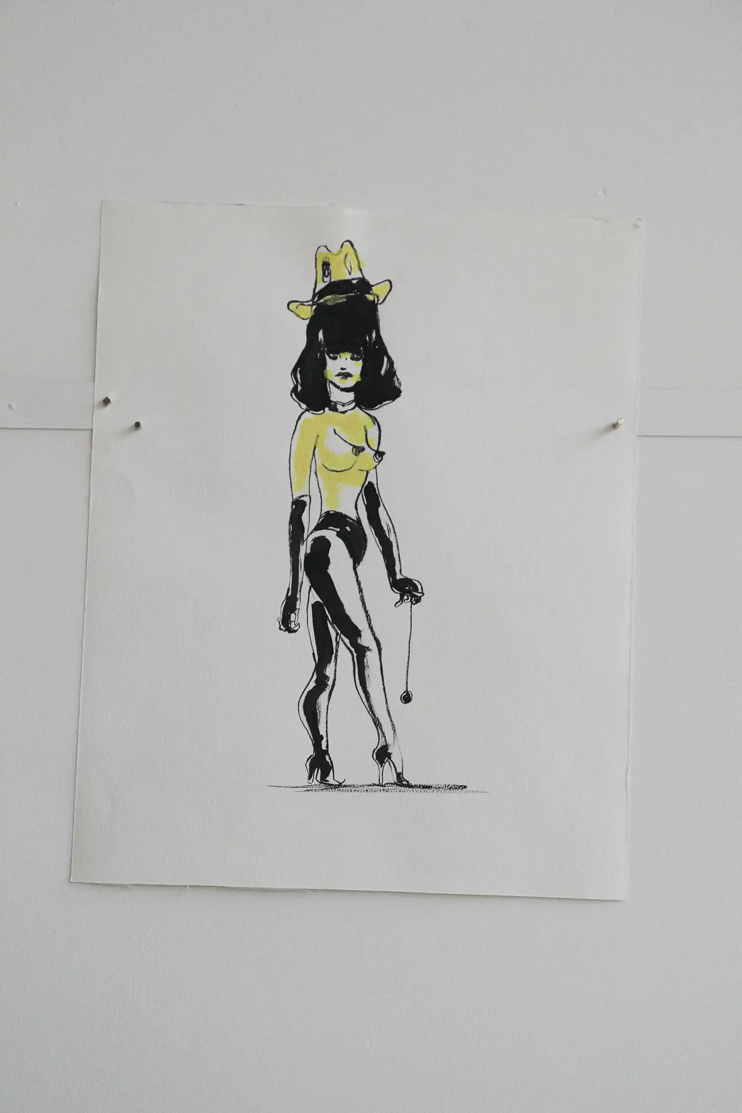
During the day I worked in graphic design for Condé Nast, and at night I drew comics. After Antonio Lopez, the illustrator for “Vanity” – the magazine created by Anna Piaggi – passed away, Condé Nast invited a group of comic artists to the office: me, Massimo Mattioli, Lorenzo Mattotti, and maybe Filippo Scozzari. Tanino Liberatore thought the meeting was on another day. We were just a bunch of young artists. That is how I got into the fashion world – but I never forgot what comics had taught me. With access to full pages, I started building short stories through single images. We made one or two issues. Liberatore had drawn some scenes with Franco Moschino wearing a cowboy hat. The group fell apart because no one else cared much about fashion. I stayed, though – fashion became my excuse to keep drawing.
Why fashion magazines need more illustration: between visual poetry and narrative drawing
François Berthoud: Illustration is not just a simplified version of photography. A drawing can be detailed and capture a subject precisely, while a photo can be abstract – like the blurred images of Paolo Roversi. If I want to draw a Yohji Yamamoto outfit, I can do it with precision, if that is the goal. It is a matter of aesthetics, of visual impact, of poetry. There is a difference in timing: photography is much faster – you can take many shots in a day – while one of my illustrations takes longer than a day to finish.
Today, magazines’ art directors are more interested in photography. Few have a deep knowledge of drawing. Maybe people feel more connected to photographic work just out of habit. Illustrators usually work alone in their studios, while a photo shoot is almost like a group performance. That might be why the solitary work of an illustrator is harder to understand. Still, there should be more illustrations in magazines.
In the past, magazines featured two kinds of illustrations: some were made just to describe a scene, and others were created by artists who had a way of telling stories. The first kind explains everything – even down to a button. The second, more abstract one, uses fewer lines to tell the story, because not everything has to be shown in full detail.
I make quick sketches based on an idea, but my work also involves precision. When I prepare a linoleum block, I start from an accurate drawing – because I need to know where to cut and carve. It is almost a mechanical process. I have thought about using a laser cutter on the design, but the result I want can only be achieved by hand. Each line comes from a different sharp tool. To do the same thing with a machine, I would have to vectorize every detail of the drawing – and at that point, it makes more sense to just do it by hand.
François Berthoud
François Berthoud (b. 1961) is a Swiss Italian illustrator. Trained in graphic design in Lausanne, he started off as a comic strip artist for underground magazines and later joined the fashion world as an illustrator for Anna Piaggi’s avant-garde magazine “Vanity”. He has worked with major brands and magazines worldwide, such as “Vogue”, “Numéro”, “Interview”, Viktor & Rolf, Bulgari and Tiffany, and in 2014 he animated a comic for Prada’s perfume Candy Florale.
Gabriele Della Maddalena