More Logo or No Logo: why Louis Vuitton wants it even more
While the system pushes the no-logo narrative through quiet luxury, Louis Vuitton continues to hold its position by keeping power on the logo mania — the Speedy P9 shall prove it
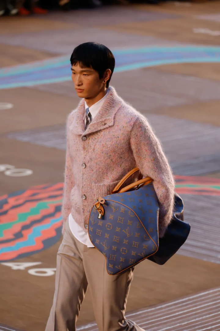
Speedy P9 in Milan: Louis Vuitton’s reintroduction of an icon
The Speedy returns to Milan — or rather, passes through it. It has maintained a persistent presence in Louis Vuitton’s vocabulary for over ninety years, resisting multiple cycles of trend and rejection. Through it all, the bag has accepted change without submitting to it.
On April 9th, the Speedy P9 came to Milan. At the Maison on Via Montenapoleone, an artisan demonstrated how an icon is born — the attention to detail and the savoir-faire that make this bag a symbol of craft excellence. In 2026, this historic piece arrives as the Speedy P9 — an updated name accompanied by altered details. The leather is softer, the proportions are refined, and the monogram feels less mechanical than ever before. Yet through all these changes, one thing remains untouchable: its instant legibility. This is where the question shifts from what the Speedy is to what it represents, particularly within the current aesthetic climate defined by the principle of less is more.
The past few years have pushed less is more to its limit: subtraction, no-logo, no-name. The aesthetic concept of quiet luxury dominates the scene, signaling belonging only to those trained to recognize it. Visibility has become tied to excess, read as vulgarity. Brands associated with discretion now lead the space, offering clean presentation and quiet surfaces devoid of visual excess of any kind.
Yet Louis Vuitton exists alongside these brands, firm in its position, continuing to use the logo — and even insisting on it. This is structural confidence: the monogram is always present, neither hidden nor exaggerated. The question is where Louis Vuitton stands in this climate of subtraction, and how it is even more relevant in a moment that actively rejects the logo.
The fall of the logo: from showing to hiding
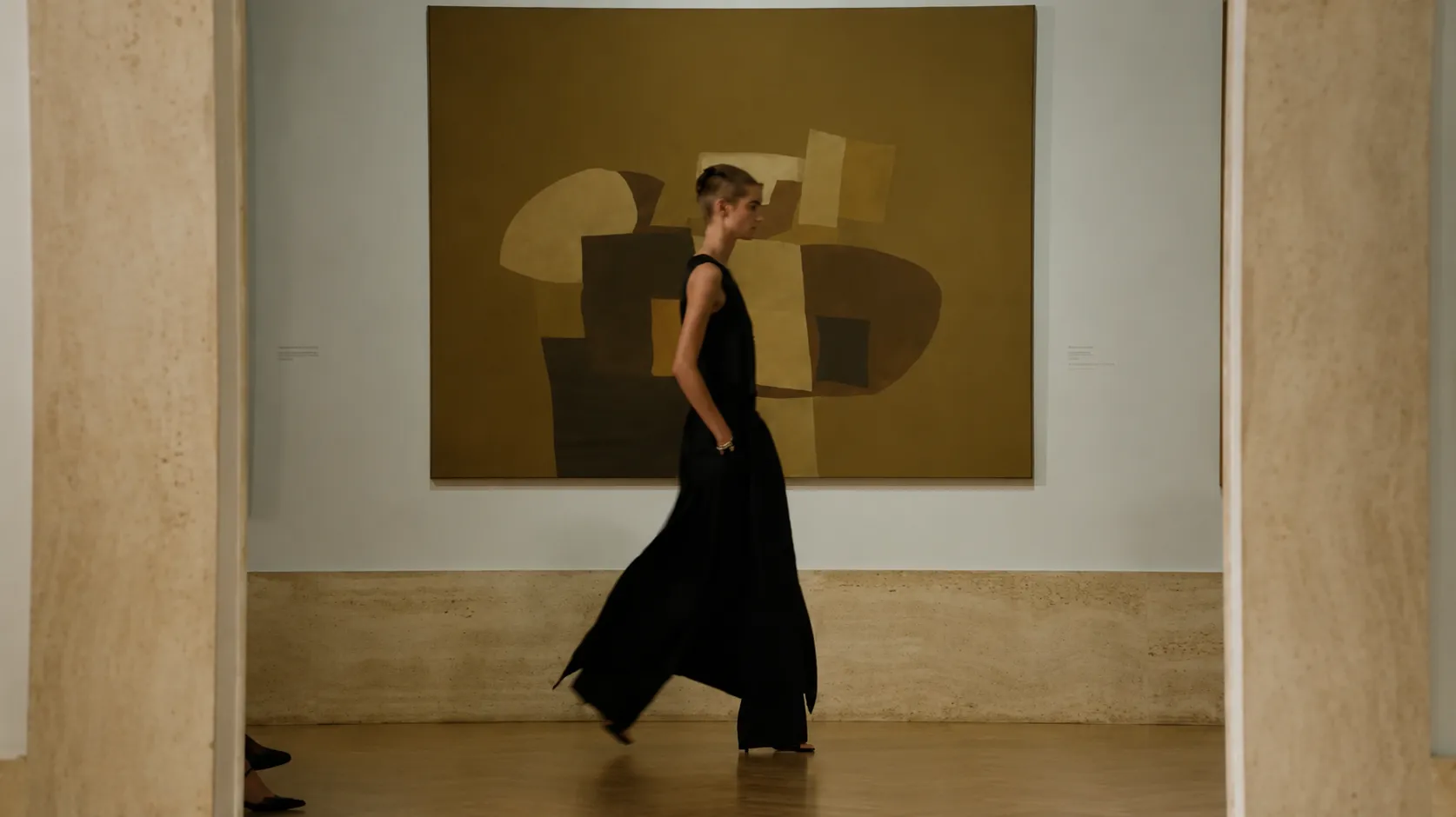
Louis Vuitton itself has also experimented with the minimalism of quiet luxury — most notably in its recent men’s Trunk collection, where clean lines replaced visible branding, letting fabric, cut, and structure do the speaking. Silence becoming the statement. It is an oscillating tendency — in fashion one moment, out the next.
The recession of the logo, however, was never a single defined moment. It unfolded gradually and quietly until visibility itself began to feel excessive. The ability to be understood by a select few — rather than recognized by everyone — became the new priority. To some, it signals a return to minimalism; to others, it is quiet luxury. But the underlying logic is unanimous: discretion over declaration, implication over display. If you know, you know has become a filtering mechanism that separates recognition from interpretation, and in doing so, redefines the luxury customer.
In this climate, the logo is where tension begins. It is legible, immediate, and widely recognized — but also endlessly replicated. In that process, the logo has shifted from being a marker of luxury to a symbol of accessibility. It requires no decoding, precisely because it is already everywhere. When a symbol can be reproduced without limit, its authority weakens. Visibility strips away exclusivity. Discretion emerged as a response. It doesn’t signal total disappearance, but rather a controlled and strategic invisibility. The logo is replaced by texture and form. Materials and construction now carry the meaning.
Louis Vuitton exists outside of this logic
Yet there are brands and objects that remain unafraid of these oscillations — ones that continue to hold firm in the power of the logo. Discretion may be where most brands are gravitating, but there are exceptions — and Louis Vuitton is one. The French house doesn’t actively resist the quiet luxury movement; it simply operates outside of it. The monogram remains, firm and unapologetic.
It remains because it has grown beyond a symbol into a system. Stabilized over time through constant repetition and cultural absorption, it requires no explanation. Its reproduction has made it permanent, attaching it not only to physical products but to the broader concept of travel, history, and movement.
This is where the Speedy sits. It exists as a fixed form that requires no reinvention. Even personalization — such as Audrey Hepburn’s request for a smaller Speedy 25 — didn’t disrupt its permanence. If anything, it demonstrated that the bag could adapt while preserving its recognition.
Most brands apply the logo, while Louis Vuitton embeds it. An applied logo can be removed or reduced; an embedded one, like the monogram, defines the object entirely. Visibility, in this case, becomes a condition — a piece of cultural memory already internalized. This permanence is what keeps the brand unaffected by shifting climates, reflected in the numbers: Louis Vuitton ranked as the most valuable fashion brand in 2025, with a brand value of $40.7 billion.
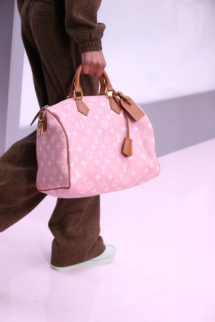
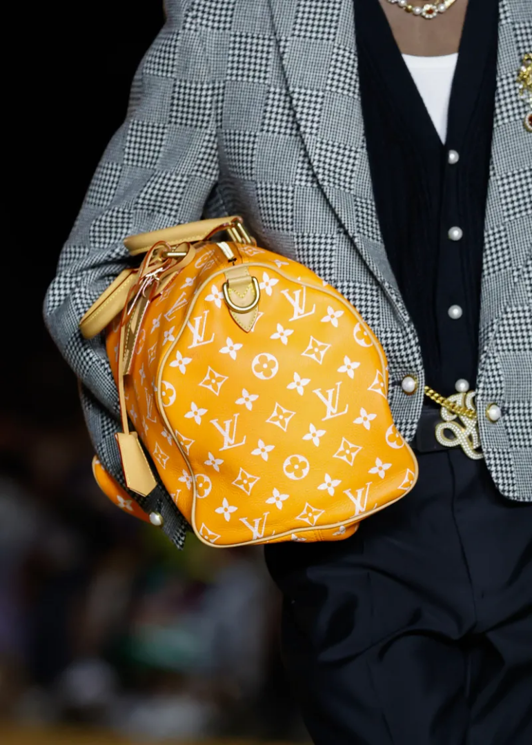
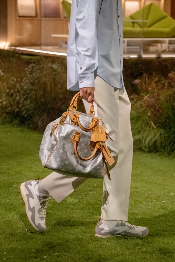
The Speedy P9: a recalibration framed as a debut
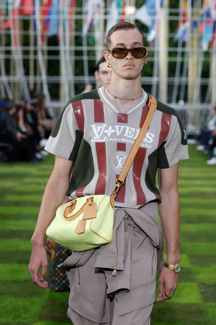
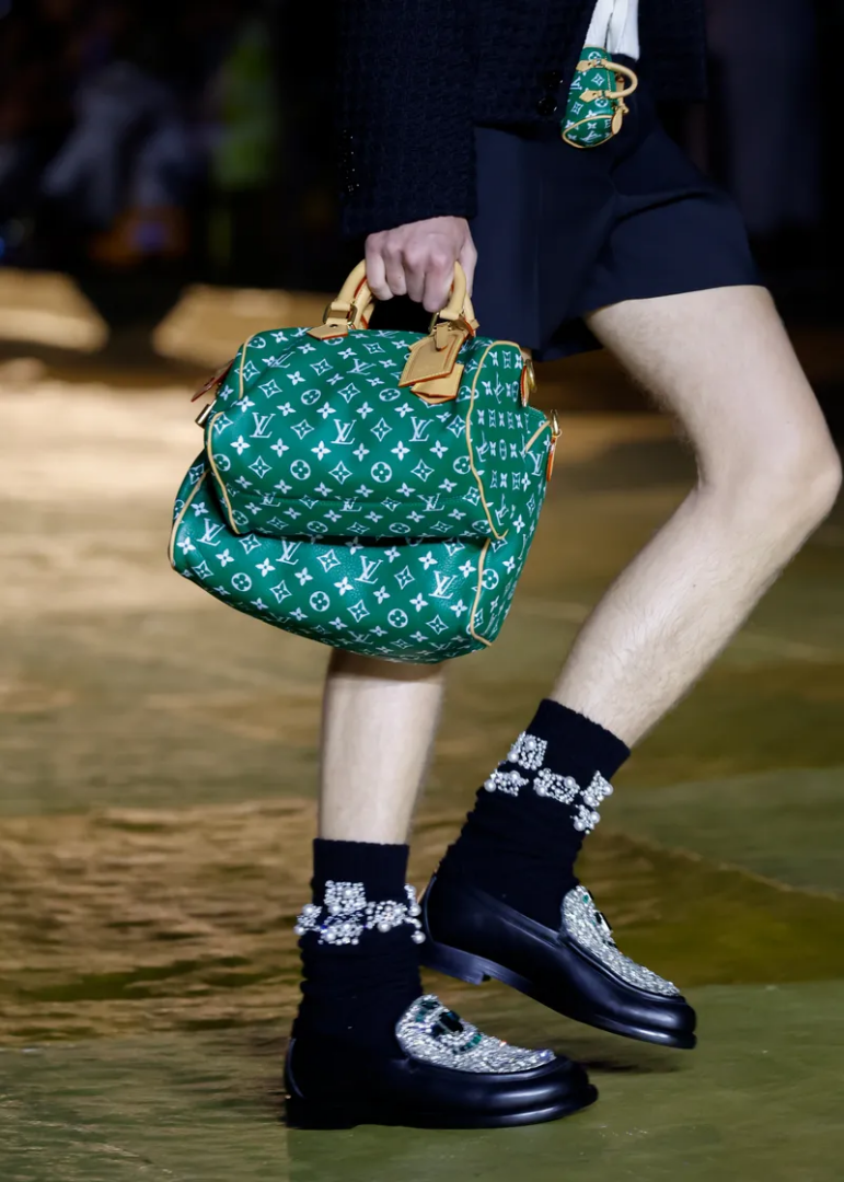
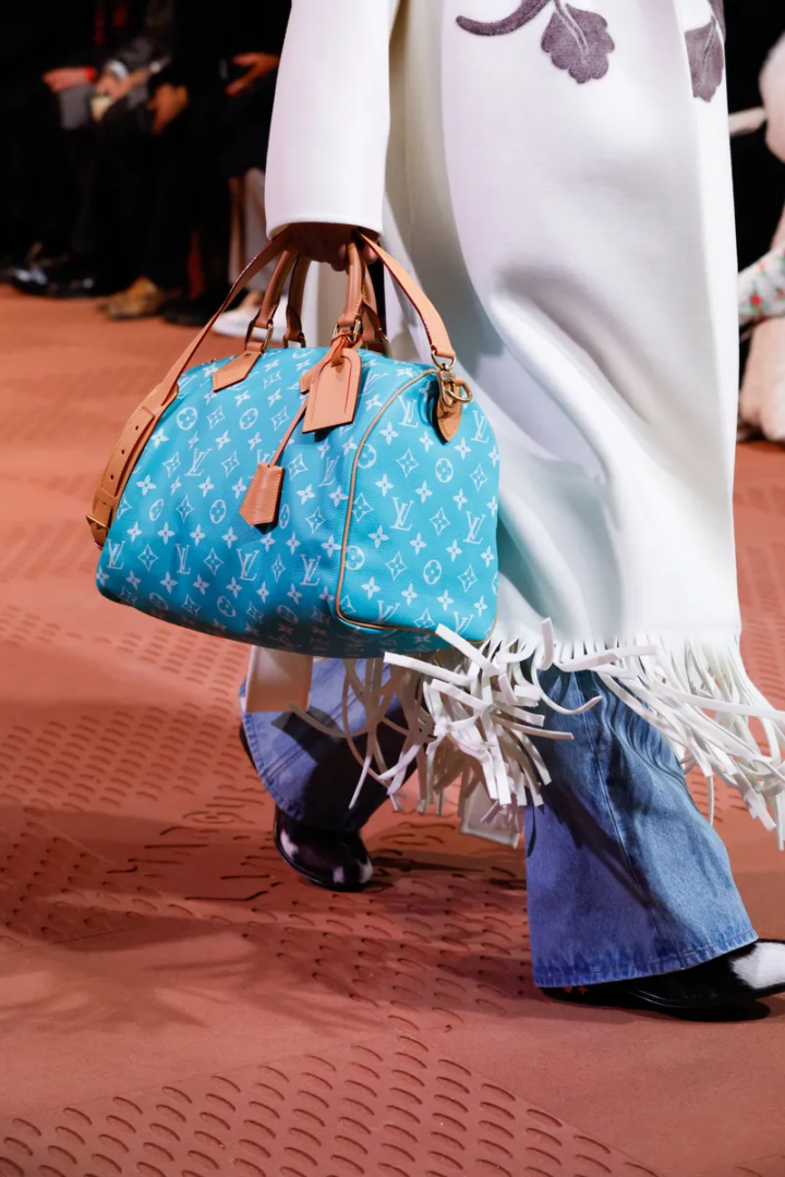
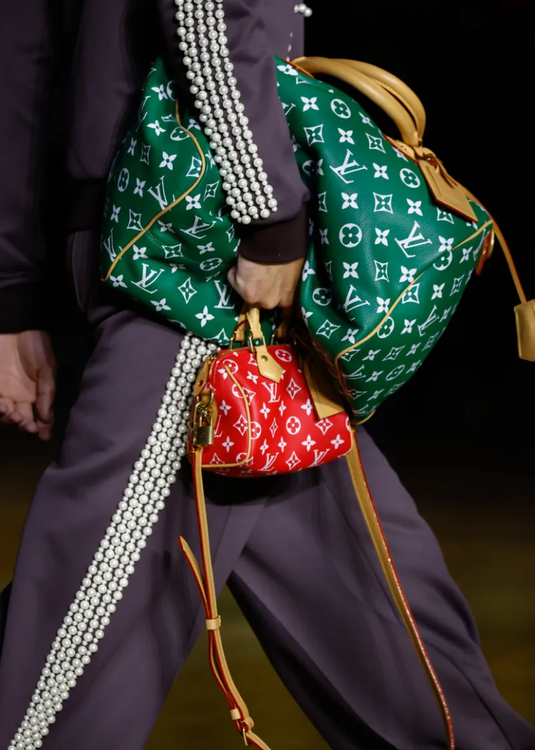
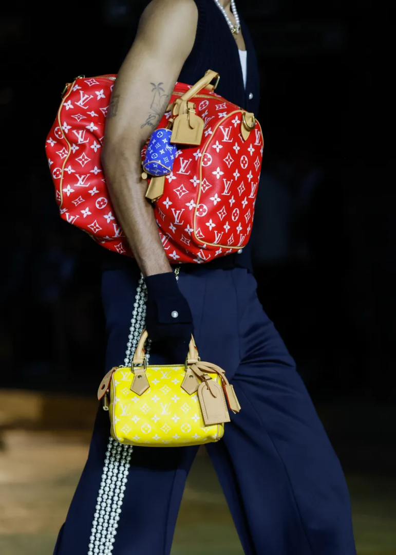
Pharrell Williams presented the Speedy P9 during his first Spring/Summer 2024 show in Paris — a moment that felt like an introduction but was, in fact, a repositioning of something already deeply established. The bag was reintroduced with the same fundamental structure; the update was in its treatment. The monogram is still present, but softer and less rigid. It now carries the suggestion of craft, distancing itself from the industrial precision historically associated with the pattern. The logo remains fully legible, but is less declarative — less statement, more texture.
Williams’ Canal Street references arrive as an unspoken acknowledgment of a long-standing tension. The bold, unexpected colorways chosen for the Speedy P9 cite the replicas that have long circulated on Canal Street — a place synonymous with counterfeits and imitation. Rather than denying this ecosystem of appropriation, the Speedy P9 incorporates it. This reflects a clear understanding of the cultural space the bag inhabits, responding to it through the modulation of the logo rather than its disappearance.
How the Monogram holds its position
For most brands — emerging or otherwise — the logo reads as aspirational. It asserts value, communicates belonging, and attempts to position the object within a hierarchy that still needs to be proven. Visibility, in those cases, feels excessive precisely because it is compensating for something not yet fully secured.
Louis Vuitton has changed this dynamic. For the Maison, the logo functions as confirmation. It doesn’t communicate status — status has long been established. Instead, it acts as an identifier of something beyond the brand itself: travel, history, luxury, movement. This is how the monogram stands the test of time. It arrives already loaded with meaning.
130 years of the Monogram
2026 marks the 130th anniversary of the Maison’s monogram, and its celebration will span the entire year. The move quietly communicates the brand’s view of the logo as something unquestioned, stable, and resolved.
The Monogram Anniversary Collection is structured in distinct parts, each revisiting the iconic pattern through material and technique. The VVN line focuses on untreated cowhide — Vache Végétale Naturelle — emphasizing surface, patina, and gradual transformation over time. The Time Trunk pieces translate archival references into trompe-l’œil prints, reproducing the visual language of historic trunks through contemporary production: metal corners, aged textures, structural details rendered anew. The Monogram Origine introduces a jacquard weave in linen and cotton, softening the surface while preserving legibility.