Diagrams: there is no such thing as an innocent map
From W.E.B. Du Bois to algorithmic dashboards, diagrams have long shaped the way societies classify knowledge, produce consensus, and visualize power. Cornelia Mattiacci and Giulio Margheri discuss the research developed by AMO/OMA for DIAGRAMS
There is a moment in the history of knowledge when the world ceases to be narrated and begins to be decoded. It is at this threshold that the diagram asserts itself not as a simple illustrative tool, but as an operative language – a true machine of thought. A language, indeed.
The diagram possesses a grammar – axes, scales, relationships, flows – and a syntax capable of organizing hierarchies, priorities, and causalities. Like any language, it does not merely describe; it interprets and directs. It determines what is relevant and what is marginal, what can be seen and what must remain invisible. The diagram is never neutral. It is a form of visual power that translates complex phenomena into images that appear objective yet are oriented.
DIAGRAMS. A Project by AMO/OMA, first presented by Fondazione Prada at Ca’ Corner della Regina during the 2025 Venice Architecture Biennale and subsequently reconfigured for Prada Rong Zhai in Shanghai, approached the diagram as a cultural technology: a device capable of organizing reality, shaping decisions, and producing visions of the future. The Shanghai chapter remained on view until 21 June 2026, extending a research project conceived not as a fixed exhibition but as an evolving investigation.
Rather than assembling a collection of data, DIAGRAMS functioned as an atlas of instruments – scientific, military, economic, political, and urban – spanning centuries and geographies, revealing how the diagram has long operated as one of the structural mechanisms of knowledge.
Big Data, predictive models and visual authority: why diagrams are never neutral
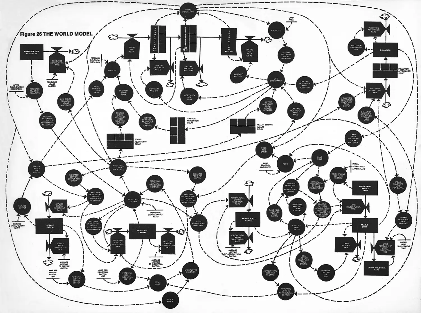
In an era dominated by Big Data, diagrams promise clarity. The question is whether they deliver it. What emerges is a mediated form of truth shaped by systems that transform information into operational models. The linearity historically associated with truth dissolves into predictive analytics, algorithmic visualizations, and dashboards that do not simply describe the world but actively prescribe it.
As Rem Koolhaas, founder of AMO/OMA, has noted, “the diagram is an almost permanent tool: independent of verbal language, capable of adapting to any medium, applicable to every area of human life.” It belongs to no single discipline. It operates across architecture, fashion, economics, religion, and social inequality. This independence has made the diagram one of the most powerful – and ambiguous – tools of modernity.
Some diagrams retain the capacity to generate empathy. They do not reduce complexity; they expose tensions: climate crisis, systemic inequality, resource distribution, migration, and war. In these cases, the diagram becomes an interface between abstraction and lived experience. What appears as graphic order reveals underlying instability.
From Venice to Shanghai: how DIAGRAMS was reconfigured at Prada Rong Zhai within a new architectural and cultural framework
The project did not conclude in Venice. It shifts scale and geography, arriving in Shanghai at Prada Rong Zhai in March 2026. This is not a simple transfer but a reconfiguration. The exhibition is reactivated within a different architectural and cultural context, demonstrating the diagram’s capacity to absorb location and rewrite itself.
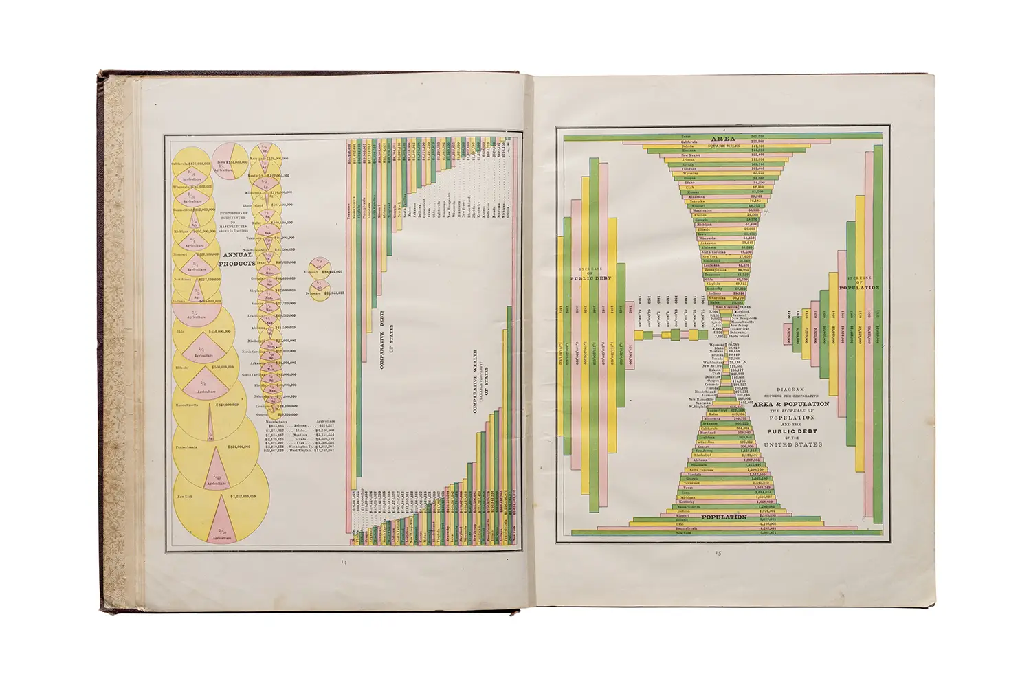
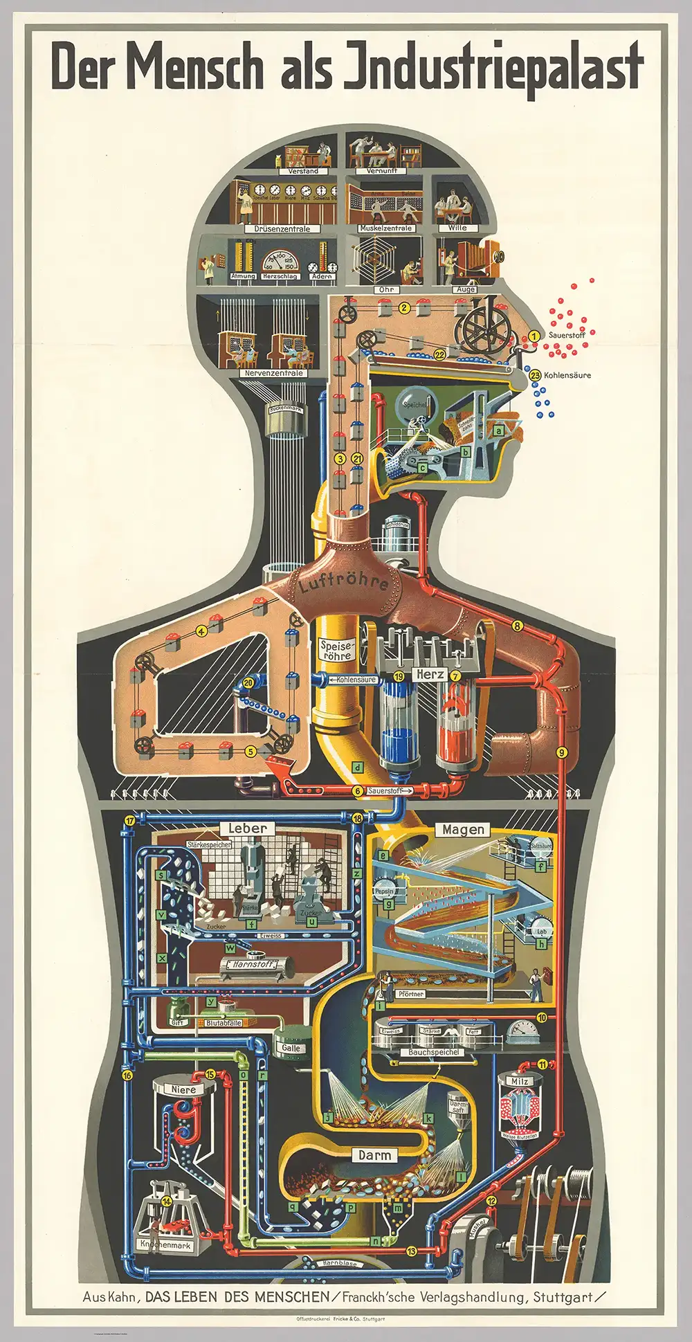
Prada Rong Zhai, a 1918 historic residence restored by Prada and reopened as a site for cultural production, frames the exhibition within spaces marked by domestic traces and layered histories. The project unfolds across five thematic sections – Built Environment, Body, Resources, Truth, Value – each addressing structural questions shaping the present. Two historical deep dives punctuate this structure. The illustrated encyclopedia Sancai Tuhui represents an early attempt to order the world through images. The work of W.E.B. Du Bois, at the turn of the twentieth century, transformed charts and diagrams into tools of visual communication which contributed to social and political awareness. These references demonstrate that the diagram does not merely clarify reality; it interrogates it.
This investigation emerges within the long-standing dialogue between Prada and AMO/OMA. Over time, their collaboration has dissolved boundaries between architecture, fashion, cinema, politics, and research. The exhibition reflects this hybrid framework, where disciplines intersect rather than remain isolated. The systems governing the present are no longer exclusively mechanical. They are cultural, symbolic, and systemic. The diagram, capable of holding abstraction and material reality together, functions as one of their primary languages.
Cornelia Mattiacci and Giulio Margheri on DIAGRAMS: an interview with Fondazione Prada and OMA/AMO
Reframing DIAGRAMS in Shanghai: adapting the Venice exhibition to Prada Rong Zhai and a domestic architectural setting
We spoke with Cornelia Mattiacci, Exhibition Curator at Fondazione Prada, and Giulio Margheri, Associate Architect at OMA/AMO, to further examine how the diagram evolved from a technical tool into a curatorial and theoretical device.
Cornelia Mattiacci. Reframing the exhibition within a different context was stimulating, beginning with the spatial dimension. Prada Rong Zhai is a former private villa from the early twentieth century – a more domestic environment. While the Venice chapter was inspired by the model of the Western library, Shanghai required a different response, shaped by the architecture and its cultural framework. This shift informed the selection process, enabling the inclusion of new and previously unseen diagrams within the exhibition’s narrative.
Where there is no data, there is no statistics and diagrams cannot be designed. Natural phenomena such as volcanic eruptions and earthquakes resist prediction, because time lapse between first signals and actual manifestation of the event is too short. Politically speaking, perhaps we need diagrams capable of countering algorithmic populism – tools as effective as memes yet grounded in critical infrastructure rather than slogans.
Philippe Rekacewicz, Gilles Deleuze and Cesare Lombroso: questioning the neutrality and authority of diagrams
Giulio Margheri. There is a statement by cartographer Philippe Rekacewicz: there is no such thing as an innocent map. Every diagram reflects choices – what data to include, what to exclude. Some diagrams appear authoritative because of their refined form yet later prove to be entirely wrong. Cesare Lombroso’s diagrams, for example, are visually compelling but based on deeply flawed assumptions. Their aesthetic precision once lent them credibility.
CM. The question about the diagram’s neutrality. A key reference was a statement by Gilles Deleuze that informed the early stages of the project: the idea that a diagram is a possibility of a fact, not the fact itself. This introduces an interpretive dimension, foregrounding the role of authorship and intention, as well as the ways in which diagrams are used. In this sense, diagrams can never be innocent. They reflect a perspective, a choice, a point of view – an idea that resonates with the critical framework of the exhibition.
On one side, the diagram has always been integral to OMA’s identity and critical thinking; on the other, long-term research is central to Fondazione Prada’s approach. The turning point came when we encountered the work of W.E.B. Du Bois.
W.E.B. Du Bois and the birth of modern infographics: diagrams as tools against racial prejudice and social inequality
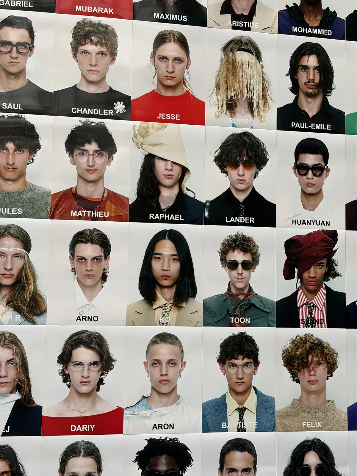
CM. The turning point came when we encountered the work of W.E.B. Du Bois. His charts and diagrams, produced with the Department of Social Studies at Atlanta University around the turn of the twentieth century, documented the social conditions of African American communities in the United States. Du Bois started undermining the issue of racial prejudice using the high-speed train of proto-modernist aesthetics – striking content, in many ways. His charts are considered milestones in the history of infographics. What struck us most was their visual power: they are undeniably informational, yet they possess a distinct artistic quality. That ambiguity – where a diagram ends and an artwork begins – sparked a deeper discussion at the intersection of visual arts, architecture, and the history of data visualization.
How diagrams function inside OMA: from internal communication tools to an open-ended research project
GM. Diagrams have been part of OMA’s daily practice: tools for internal communication, dialogue with clients, archiving, and processing information. Yet until this project, there had never been a systematic research effort focused specifically on diagrams. The conversation with Fondazione Prada transformed a constant, intuitive use into a structured investigation. We began collecting diagrams – our own, but especially those from outside the office – to contextualize them, compare them, and understand their broader cultural relevance. It became clear that this was not a finite project, but an open research process. That openness allowed the exhibition to evolve and take new forms beyond Venice.
Deep fakes, health apps and algorithmic populism: questioning images and truth in contemporary visual culture
CM. We live immersed in images, and diagrams are now easy to generate through algorithms that simplify what happens around us – and even within us. Consider health apps that translate our bodies, habits, and consumption patterns into charts. At the same time, the rise of deep fakes and synthetic images has undermined our trust in visual evidence. Images can no longer be assumed to guarantee truth. We need critical questions about diagrams: who produced them? with what intent? what were they meant to demonstrate? Many diagrams that circulated widely and proved persuasive presented only partial perspectives. National maps, for instance, often depict each country as the center of the world, and I’m not referring just to vintage school maps – just look at the logo of the newly formed “Board of Peace”. The parallels with today’s visual culture are evident, even if the exhibition itself does not begin from a predefined political agenda.
GM. The project responds to a contemporary condition while placing it within a broader historical frame. Although diagrams are now ubiquitous – made easier by the growing availability of data – they are far from a recent invention. We see a dual nature: diagrams are increasingly accessible today, yet they have long been tools across disciplines. Diagrams have taken multiple forms across almost every field of knowledge, from collecting and transmitting information to analysis and archiving. This long history of visualizing complex realities was demonstrating how pervasive diagrams remain today.
From Webster’s Dictionary to contemporary data visualization: defining what a diagram actually is
CM. While preparing for this interview, Giulio reminded me that our starting point was the definition of the diagram itself. We referred to Webster’s Dictionary, which describes a diagram as a graphic composition that seeks to explain rather than represent. We deliberately kept this definition broad. Within the exhibition – and across its different iterations – we encounter many kinds of diagrams: maps, charts, tables, curves, pie charts, illustrations, and even forms of video modeling.
The persuasive nature of the diagram. We tend to assume that information presented in diagrammatic form carries an intrinsic scientific authority. Its ability to synthesize and clarify makes it convincing. It is precisely this persuasive quality that gives the diagram a critical dimension – one that can be directed in multiple ways.
John Snow, William Playfair and the challenge of balancing aesthetics with analytical depth in diagrams
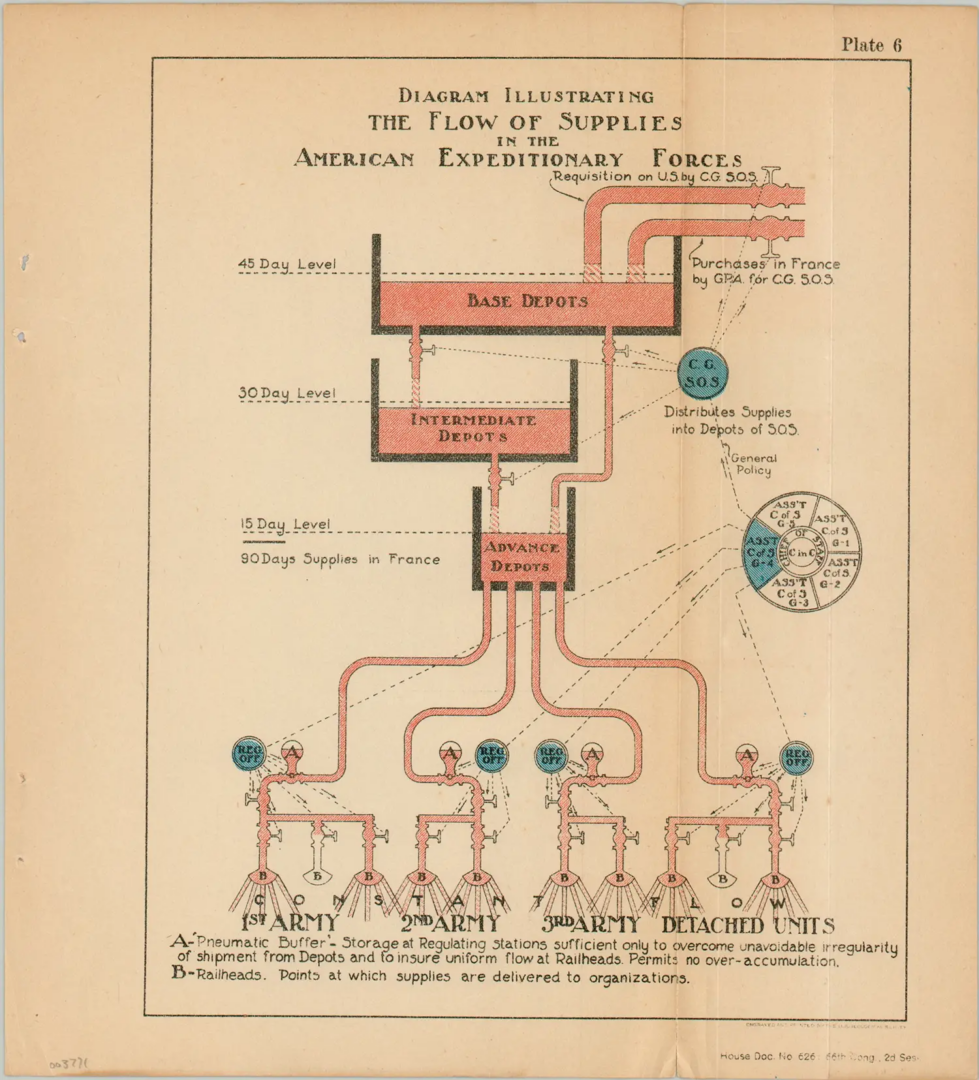
GM. We intentionally kept the spectrum broad, including objects that differed not only in representation but also in the degree to which they could be considered diagrams. Throughout the research, we constantly faced the challenge of balancing visually striking diagrams with limited analytical depth and others that appeared modest at first glance but revealed relevance when studied closely. This tension informed curatorial decisions, sometimes leading us to introduce contextual narratives where graphic form alone was insufficient. John Snow’s cholera map is an example: visually simple, yet conceptually and historically powerful. Finding this balance – between diagrams that verge on artworks and others that function as analytical tools – was one of the complex and rewarding aspects of the project.
The transversality of diagrams: from Islamic medicine and CT scans to geography, astronomy and the human body
Their transversality. Diagrams can be applied to almost any field of knowledge and they function as a supranational language. The most effective diagrams are readable without a shared spoken language. In the Body section, we move from thirteenth-century Islamic medical diagrams to contemporary CT scans. The technology changes, but the impulse to understand and visualize the body remains constant.
CM. The exhibition is structured around broader thematic sections, which we call urgencies, and this framework evolves across its different iterations. While the Venice chapter featured a larger number of sections, the exhibition in Shanghai is more focused. This approach became clearer as we explored the Asian context and encountered the Sancai Tuhui, a Ming-dynasty encyclopedia organized through diagrammatic categories. What struck us was how closely this structure resonates with the way we framed the exhibition around contemporary urgencies.
Across history, knowledge has been organized through shared macro-domains – such as astronomy, geography, architecture, and the human body – which remain urgent today. In this sense, the diagram functions as a transversal language, connecting different cultures and historical moments through a common logic of representation.
Our research showed that some diagrammatic categories have existed for as long as humanity itself, those related to the body, health, geography, astronomy, and the built environment. They reflect enduring attempts to understand and navigate the world. Other categories are more recent, shaped by modern sensibilities, such as social inequality or sustainability in urban and architectural contexts. These concerns have generated new forms of diagrams in response to contemporary urgencies.
We were also interested in how the dissemination of diagrams is tied to their formats. Once confined to an educated elite, diagrams gradually spread through print culture, education, and technological innovation, moving from manuscripts to books, atlases, and, today, digital images. This evolution reflects not only what knowledge is represented, but also who it is for and how it circulates.
From manuscripts and atlases to newspapers and dashboards: how diagrams changed formats, audiences and functions
GM. Another aspect that became evident was the variety of formats. As we began sourcing original materials, a wide spectrum emerged: from small manuscripts to magazines, postcards, posters, and eventually digital diagrams designed for screens. This diversity added a further layer, both visually and conceptually. It revealed how diagrams have shifted over time not only in content, but also in scale, audience, and function.
A telling example appears in the Value section, where an early economic curve by William Playfair – produced for a small, elite readership – is placed next to the front page of The New York Times reporting on the 2008 financial crisis. In that juxtaposition, the diagram moves from a specialized analytical tool to a mass communication device, used to explain complex economic events to the public at large.
CM. The project went through a highly collaborative process, with each partner contributing specific expertise. AMO/OMA led the critical framework and the interpretation of diagrams including areas such as the built environment, architecture, urban planning, and new technologies, which informed the sustainability section. Fondazione Prada’s curatorial department expanded certain themes by consulting on site international archives and libraries. As an institution, Fondazione Prada acted as a bridge to museums, archives, public and private collections, in dialogue with scholars and conservators, securing key loans. The collaboration with Sietske Fransen, Max Planck Research Group Leader, Bibliotheca Hertziana–Max Planck Institute for Art History, shaped the historical research for the first iteration of DIAGRAMS, and related academic activities held at Ca’ Corner della Regina.
The diagram of diagrams: how OMA and Fondazione Prada used diagrams to curate an exhibition about visual thinking itself
GM. We were careful not to turn DIAGRAMS into an exhibition of OMA’s diagrams. Instead, OMA contributed one voice among many, alongside Fondazione Prada. OMA’s diagrams appear across different sections – not as a celebration, but as evidence of how research over time has generated tools in multiple fields.
The process itself became part of the exhibition. Faced with a vast amount of material, we used diagrams internally to organize, map, and discuss the content. This eventually led to what we called a “diagram of diagrams,” displayed at the entrance as both an introduction and a reflection on the exhibition-making process itself.
DIAGRAMS was conceived as an open-ended research project rather than a closed exhibition. New diagrams and ideas kept emerging throughout the process; the show stopped expanding only because of practical constraints. Its ability to travel allows the research to keep on going.
At Prada Rong Zhai, the Sancai Tuhui encyclopedia occupies a central position, acting as a transversal reference throughout the exhibition. The Shanghai chapter is more compact and more focused. It maintains the structure of urgencies while introducing new authors, materials, and a stronger presence of animated and digital diagrams, along with research developed by OMA in the Chinese context.
DIAGRAMS at Prada Rong Zhai: exhibition dates, Fondazione Prada collaboration and practical information
DIAGRAMS, an exhibition conceived by AMO/OMA, on view until 21 June 2026 at Prada Rong Zhai, the historic 1918 residence in Shanghai restored and reopened in 2017. First presented at Fondazione Prada in Venice from May to November 2025, the exhibition investigates the visual communication of data as a powerful tool for constructing meaning, comprehension, or persuasion, and as a pervasive instrument for analyzing, understanding, and transforming the surrounding world.
Organized with the support of Fondazione Prada and presented by Prada, DIAGRAMS encourages dialogue and speculative reflection on the relationship between human intelligence, scientific and cultural phenomena, and the creation and dissemination of knowledge.
Lucia Mannella